
The challenge
Most travel guides about Taipei don’t really do it justice. They tend to repeat the same touristy spots and end up feeling kind of bland. But Taipei has so much more to offer. They have beautiful views, cozy little cafes, night markets full of energy, and hidden gems that only locals really know about. I wanted to create something that actually shows off the city’s personality and charm, not just the usual checklist. This newspaper is about capturing the real vibe of Taipei and giving people a better way to explore it.

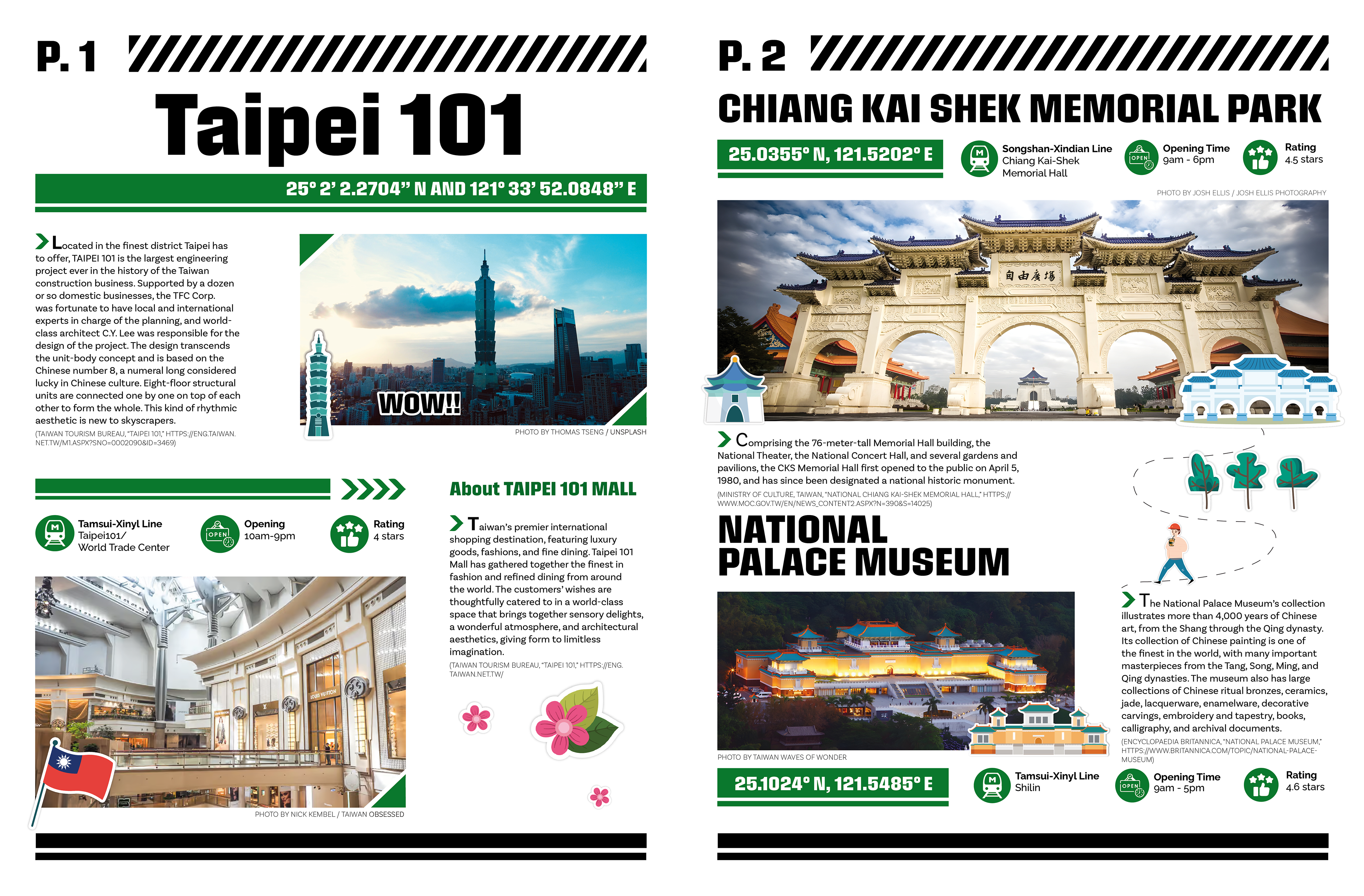
A view of the iconic Taipei 101.
The Approach
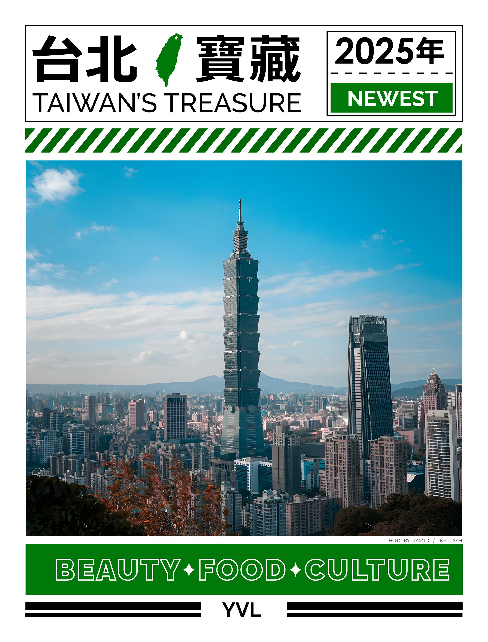
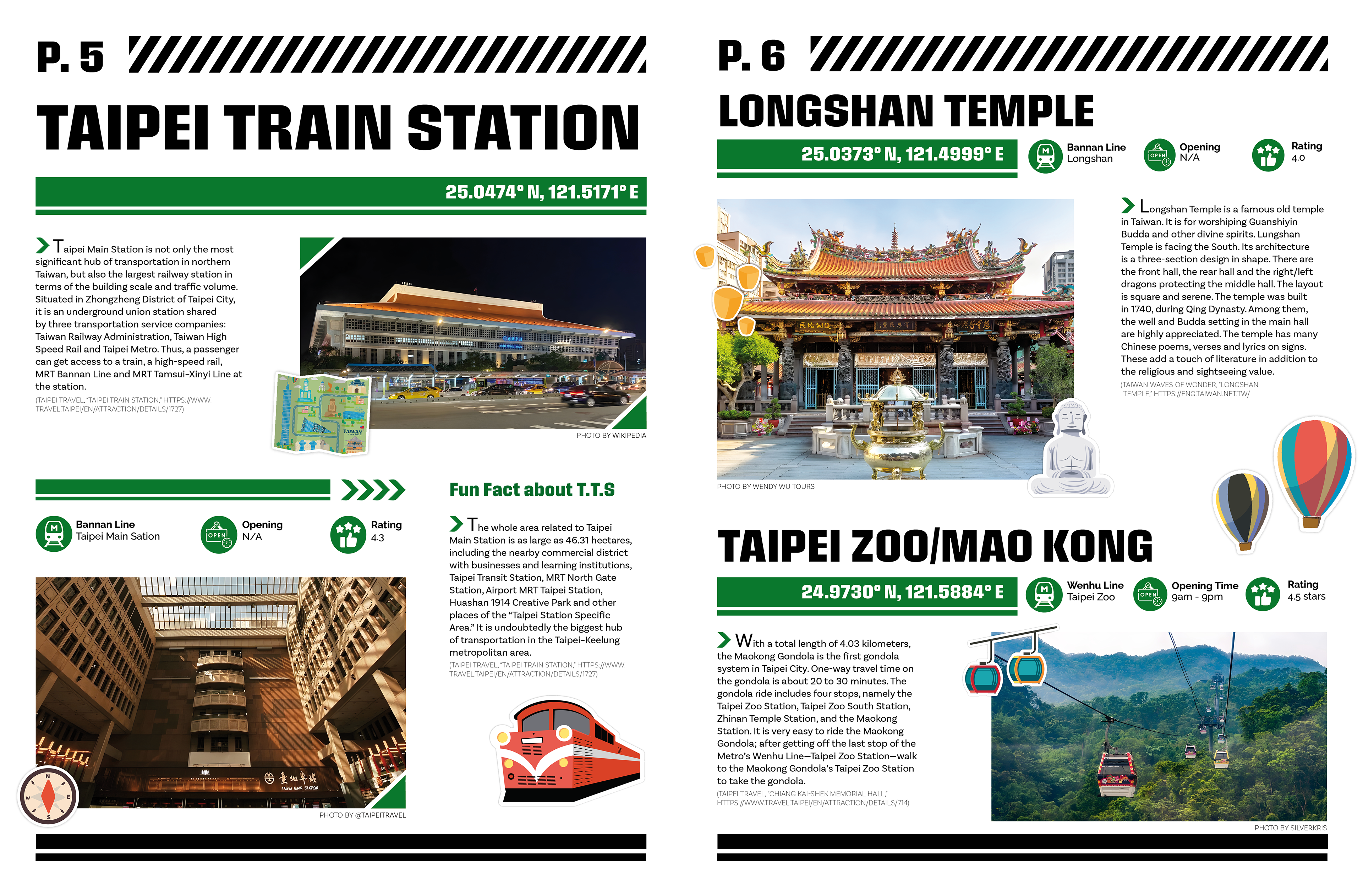
For the design, I went with that iconic green you see all around Taiwan; like the kind used in their beer branding, since it really captures a local, familiar vibe. I mixed that with a more modern layout style to keep the magazine looking clean and fresh. Each section has its own little sticker to help break things up and add some fun to the design. I also made sure to include helpful details like a short description, opening hours, ratings, and which metro station it’s near, so it’s easy to plan a visit. And of course, I added photos to give a better sense of what each place looks like.
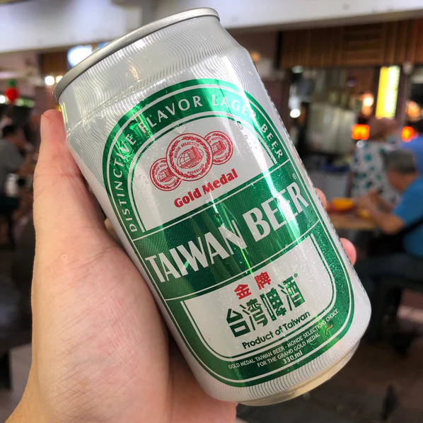
This is the famous Taiwan Beer. This green is everywhere, so I used it in my newspaper.
What I did
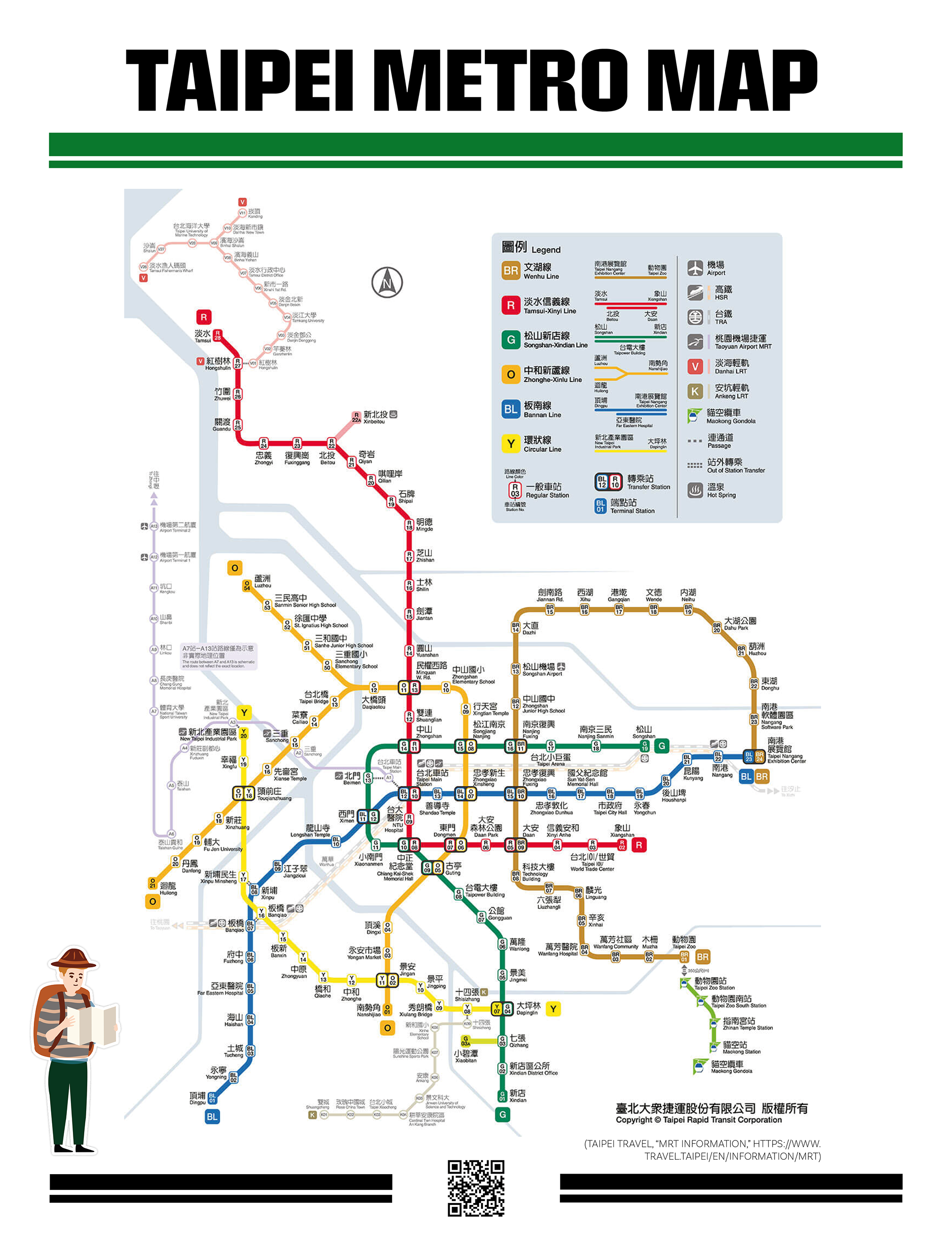
I designed a travel newspaper that highlights some of the best places to visit in Taipei while showing off the city’s unique charm. I used a bold green throughout to give it that distinctly Taiwanese feel and paired it with a modern, clean layout to keep everything easy to read. Each spot features its own little sticker graphic to make the sections more fun and organized. I also added key info like opening hours, ratings, a short description, the nearest metro station, and a photo for each location. To make it even more useful, I included a metro map on the back so readers can take the magazine with them and easily find their way around the city.
11'' x 22'' inches