The Challenge
When graphic designers are hired for a project, they often find themselves unsure of how to price their work. Without a clear pricing structure, many end up quoting a random number, which can feel unfair to both the designer and the client. This makes the process feel a bit like a guessing game, and it can lead to confusion or even frustration on both sides. The designer might end up undervaluing their work, while the client might feel uncertain about whether they’re getting a good deal. On the flip side, overpricing can push clients away. Without a consistent method to determine project costs, designers struggle to set prices that reflect their skills and time while ensuring the client feels like they’re getting good value. It’s a tough balance, and this inconsistency can hold both designers and clients back.
This is the mood board I used for the project. For this project, I wanted to do a mixture of a retro theme and also a punk style. I wanted to challenge myself with these specific styles since I have never really done anything like this before. For the paragraph typography and the titles, I am using Raleway since It is quite flexible with its bold variations. For the colours I just went on brand with Kitties and Cream (since that is the company I am basing this project on), and also added purple and yellow for highlighting.
The Approach
The goal of this booklet is to make pricing simple and fair for graphic designers. With easy-to-follow equations and clear explanations, designers can quickly figure out how much to charge for different projects. This takes the guesswork out of pricing, so designers don’t have to rely on random numbers or feel unsure about their rates. It helps them set prices that actually reflect the time and skills they’re putting into the work. Plus, it makes the whole process more transparent for clients, so they know exactly what they’re paying for. In the end, it’s all about making pricing easy, consistent, and fair for everyone, with no more confusion or feeling like you're over or undercharging.

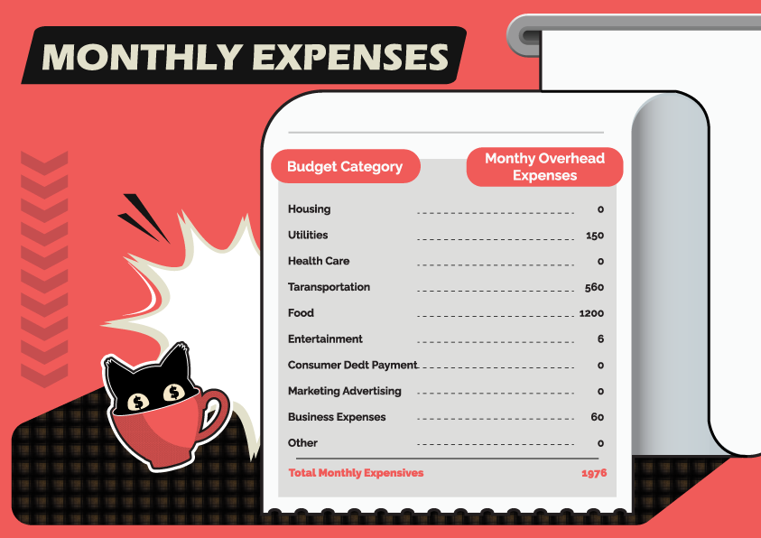
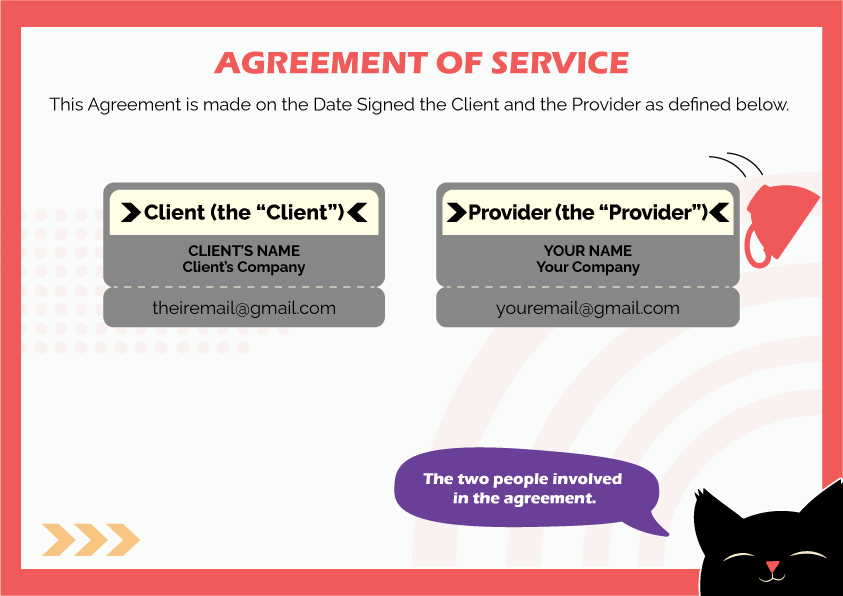
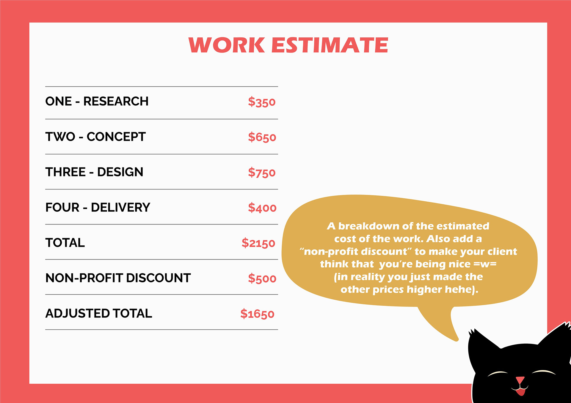
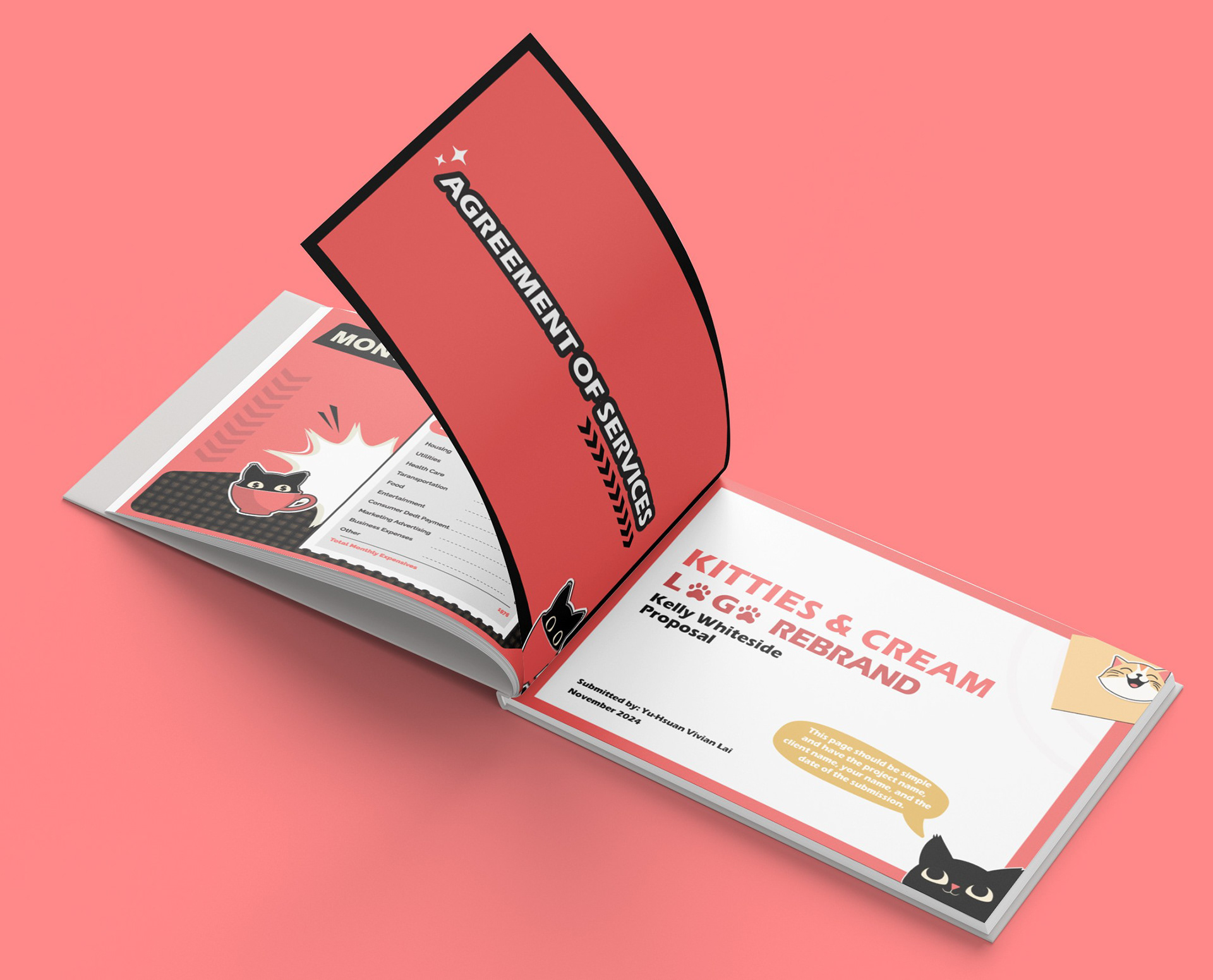
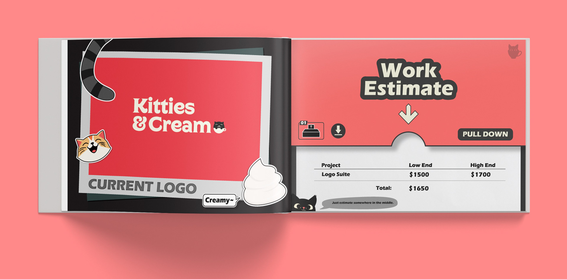
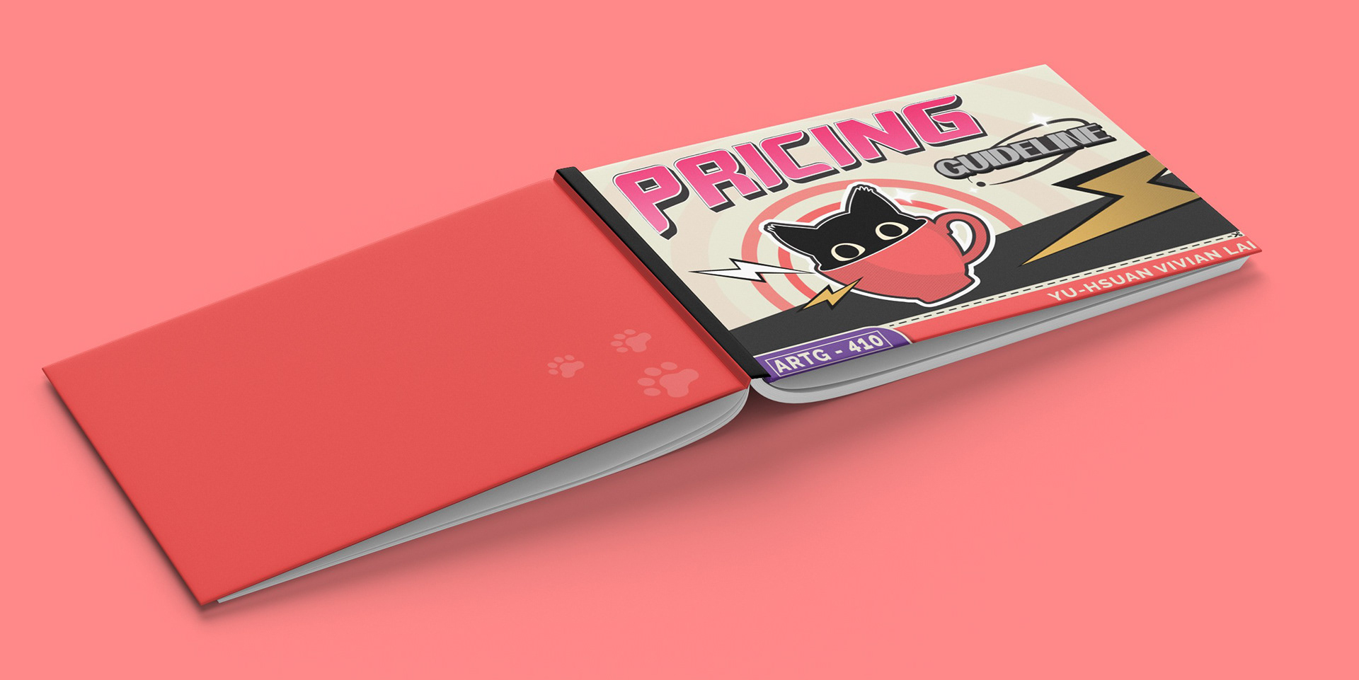
Here are some of the pages of the booklet, and as you can see, the information is clear and understandable and it is supported with fun visuals that can keep the viewers hooked.
What I did
I’m not a fan of reading big blocks of text, so I made sure the booklet was more visual and easy to follow. I used small information blocks to break down key points, making the content feel less overwhelming. To keep things engaging, I added illustrations throughout, like a cute little cat on the side of each page that explains different pieces of information. It’s a fun touch that helps readers stay interested while learning how to calculate project prices. I also made sure the layout was clean and simple, so it’s easy to skim through and find exactly what you need. The goal was to make the booklet both informative and enjoyable to use, so it doesn't feel like another boring read.i
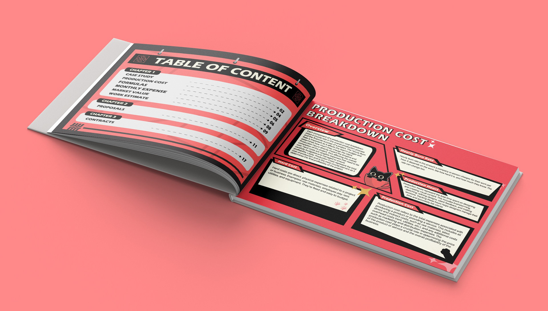

Size: 11'' x 8''