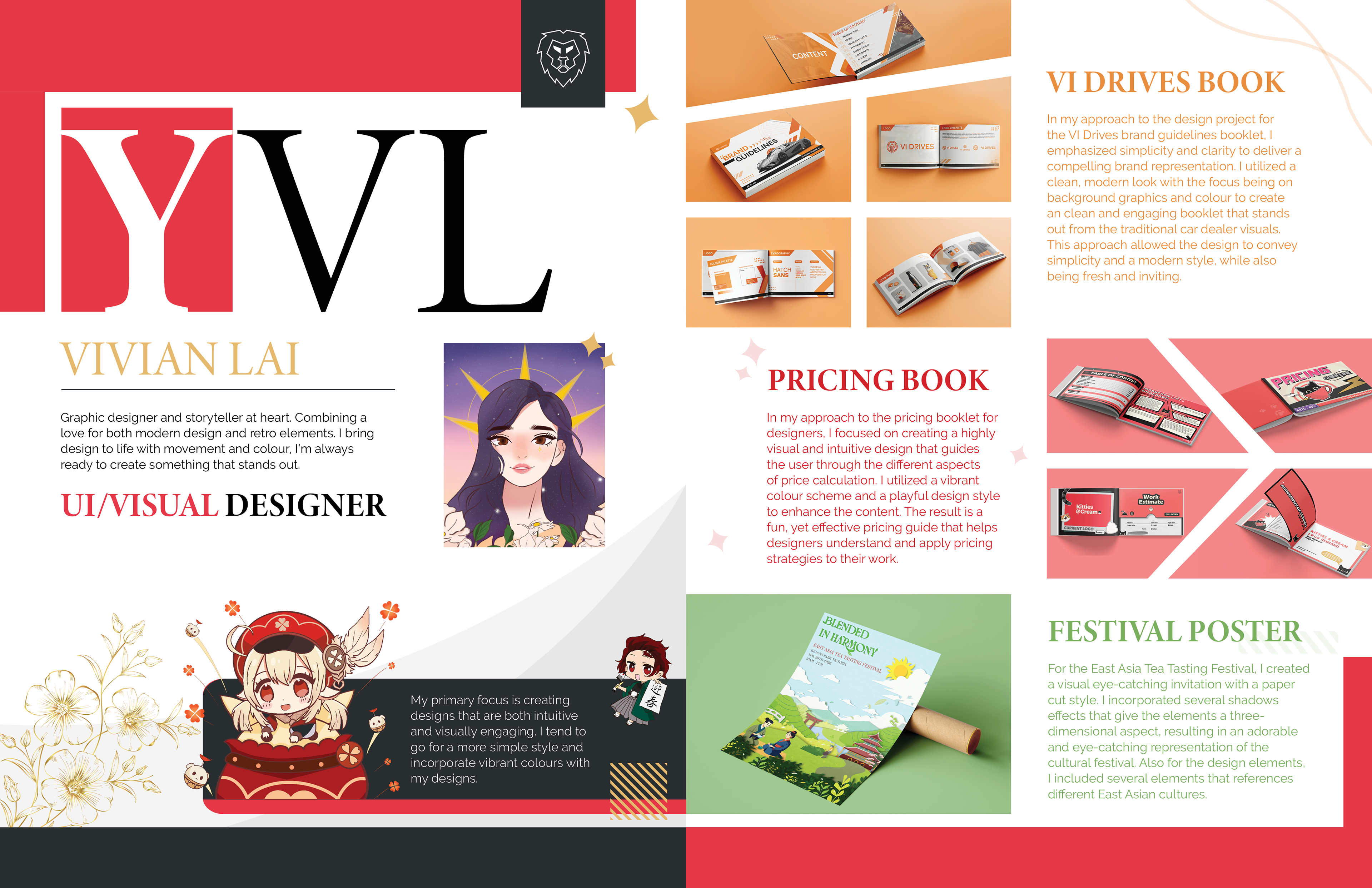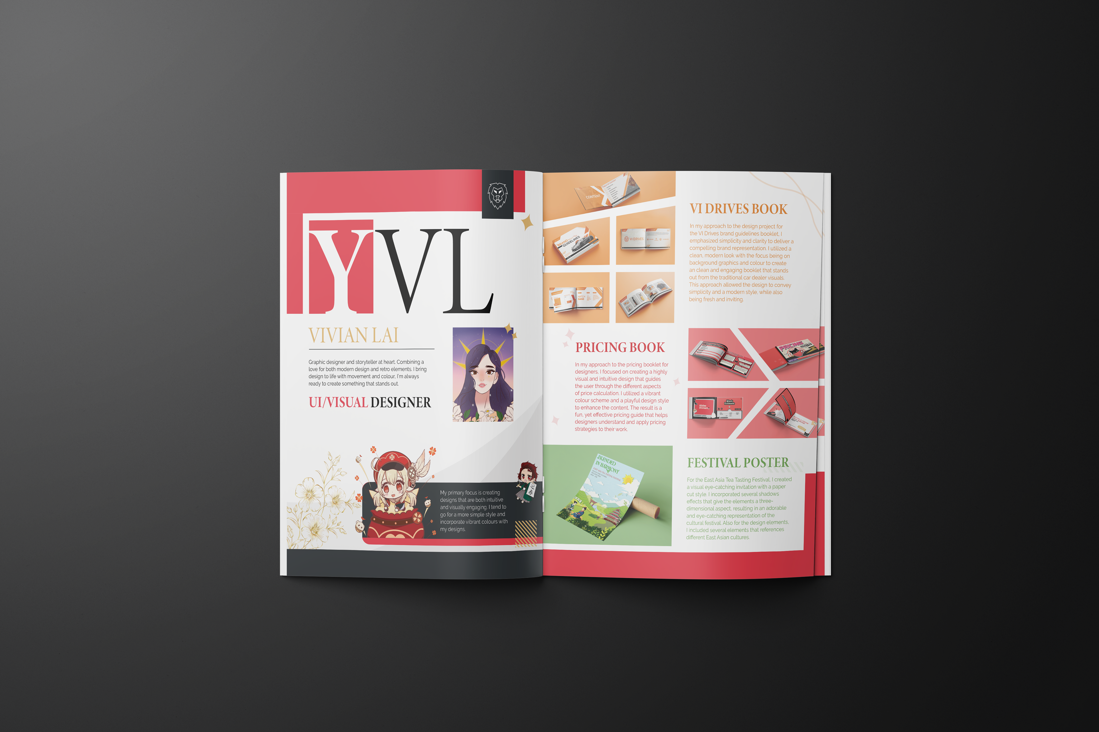
The Probelm
A lot of portfolio spreads can feel a bit too stiff or overly polished, and sometimes they don’t really say much about the person behind the work. I didn’t want mine to just be a collection of projects. I wanted it to show who I am as a designer and artist. My style leans cute and playful, but I also like clean, bold layouts, so the challenge was figuring out how to blend those things in a way that still felt cohesive and professional. I wanted something that felt personal but still had structure and style.

This is an illustration that I drew of a character named Klee from Genshin Impact.
The Approach
I based the overall look on my favorite colours, red and black; because they feel bold, slick, and a little dramatic in the best way. They helped set the tone for the whole spread. I kept the layout minimal and modern but added pops of personality through colour and composition. Each project has its own colour scheme that matches its vibe, and I used that for the text and background details to keep things visually interesting and connected. I also made space for my own illustrations, since that’s a big part of my creative voice.
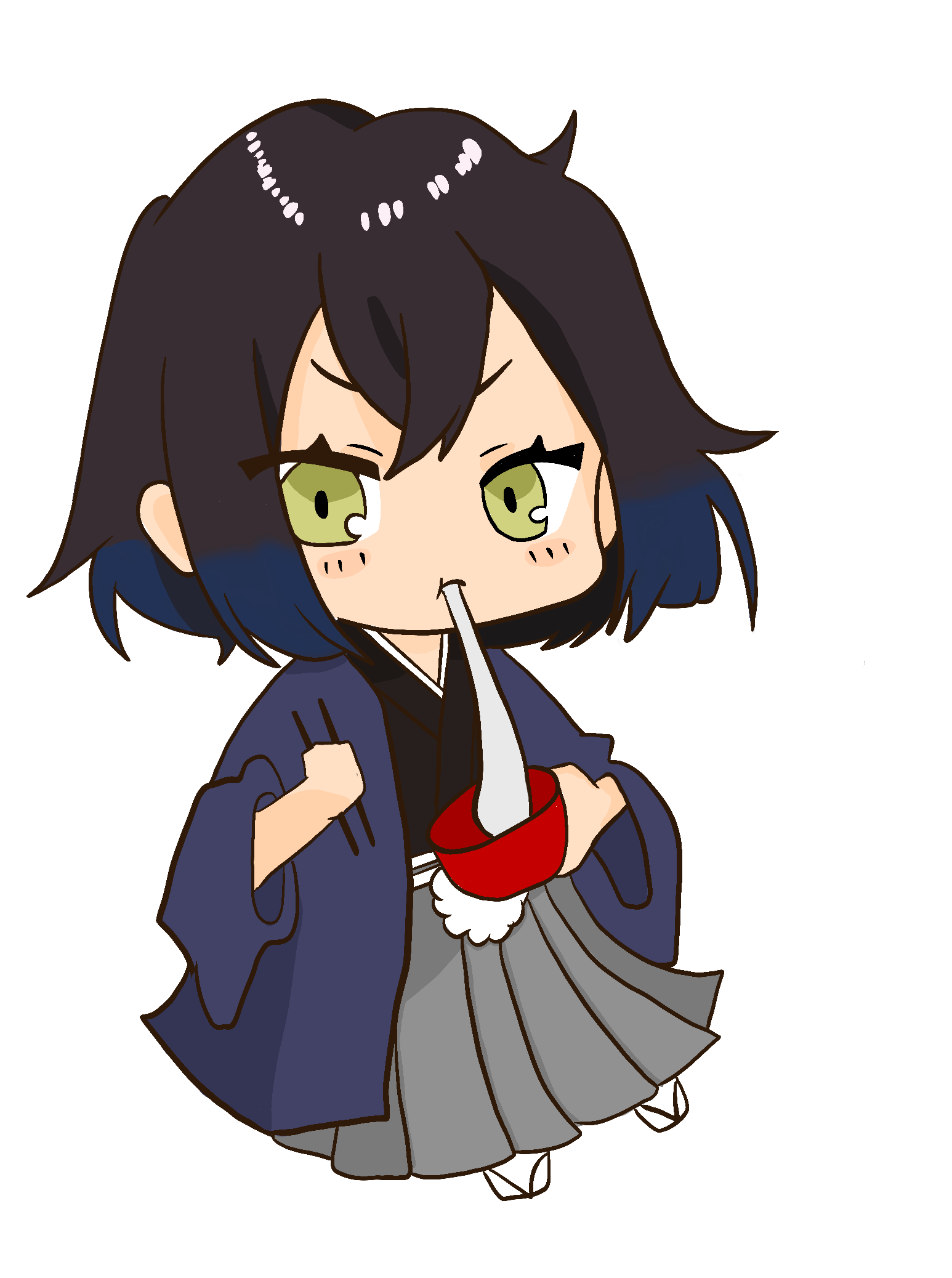
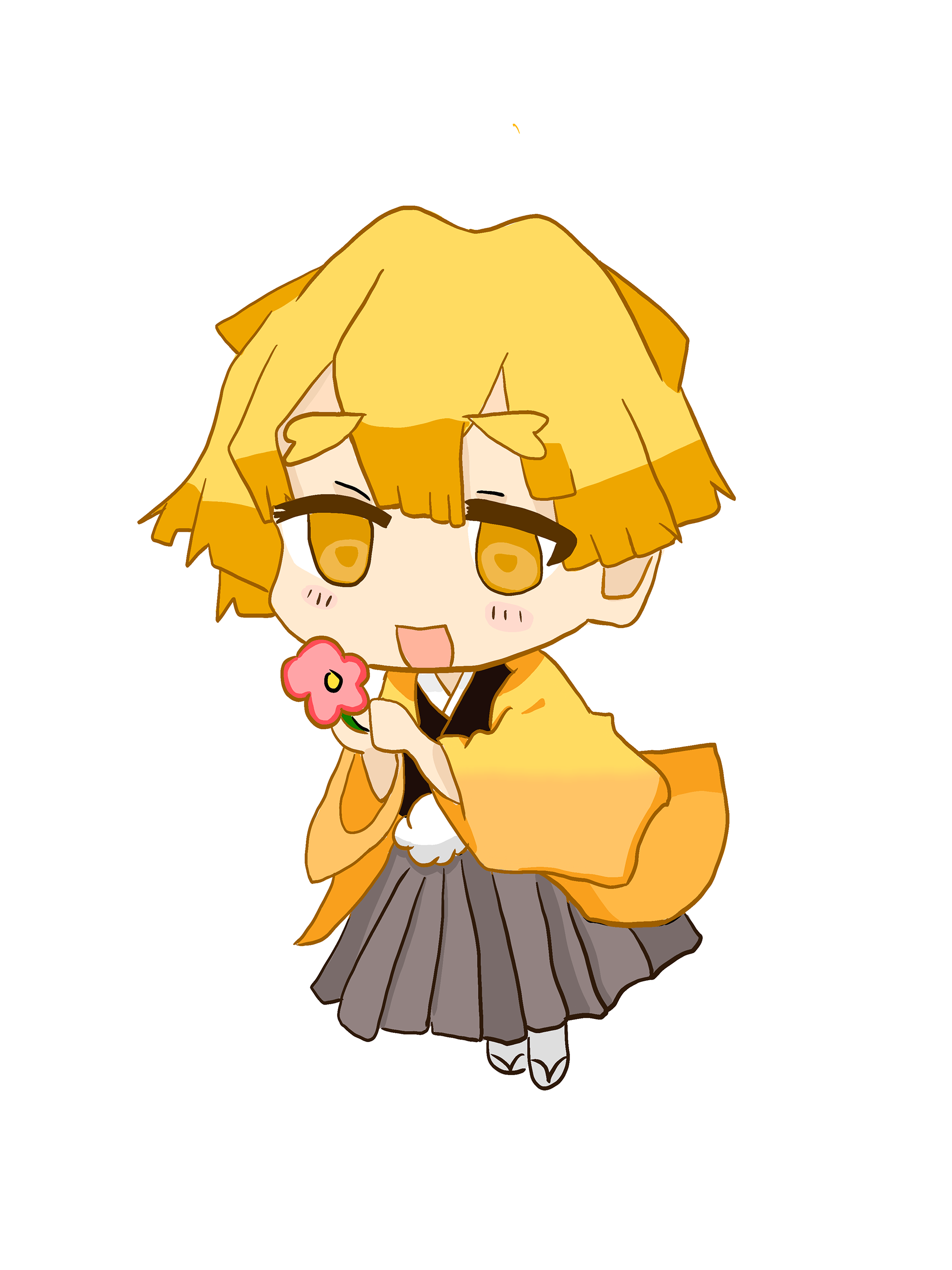
More sketches that I drew :3
What I did
I designed a full magazine spread for my portfolio that features three projects I’m proud of. For each one, I used colours and layouts that match the feel of the work, so they each stand out while still fitting into the overall design. On the left side of the spread, I included a collection of my own artwork. They are cute, fun drawings that really represent my style, and I added my name as a bold graphic element to tie it all together. The final result feels clean, eye-catching, and personal, something that shows off both my design skills and my creative identity.