The Challenge
I was tasked to create a poster for an East Asian Tea-tasting festival in Victoria, British Columbia. The challenging part was figuring out how to bring together different elements from East Asian cultures into one design while still making it unique and eye-catching. I wanted to make sure the cultural aspects felt authentic, but at the same time, I needed the poster to stand out and grab people’s attention. It had to be interesting and represent the festival well, without feeling too busy or overwhelming. My goal was to capture the event's spirit while ensuring it appealed to the audience and looked fresh.
This is the mood board I made for the project. It includes all the imagery, colours, typography, and style I want to go for. I like the paper-cut style and thought it suited the theme of the poster. For the colours, I used different greens to convey the different types of Asian teas (matcha, oolong, green tea, etc.)
The Approach
To tackle this challenge, I chose a paper-cut style design, which allowed me to weave together different cultural elements from East Asia in a unified and smooth way. The paper-cut technique has a traditional vibe but also feels fresh, which was perfect for the event’s mix of history and modern appeal. I also added drop shadows to the important parts of the poster to create a sense of depth and make those elements pop. This added a little more dimension to the design, helping it feel more dynamic and three-dimensional. Overall, my goal was to keep things visually interesting and ensure all the cultural elements worked together while ensuring the poster stood out and grabbed people’s attention.


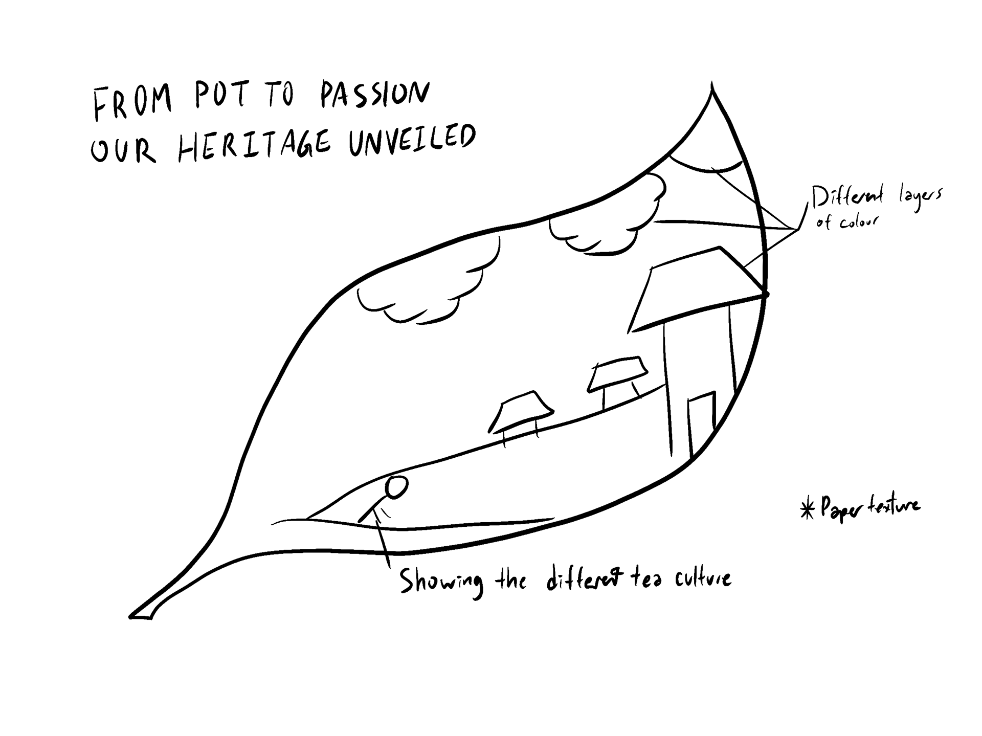
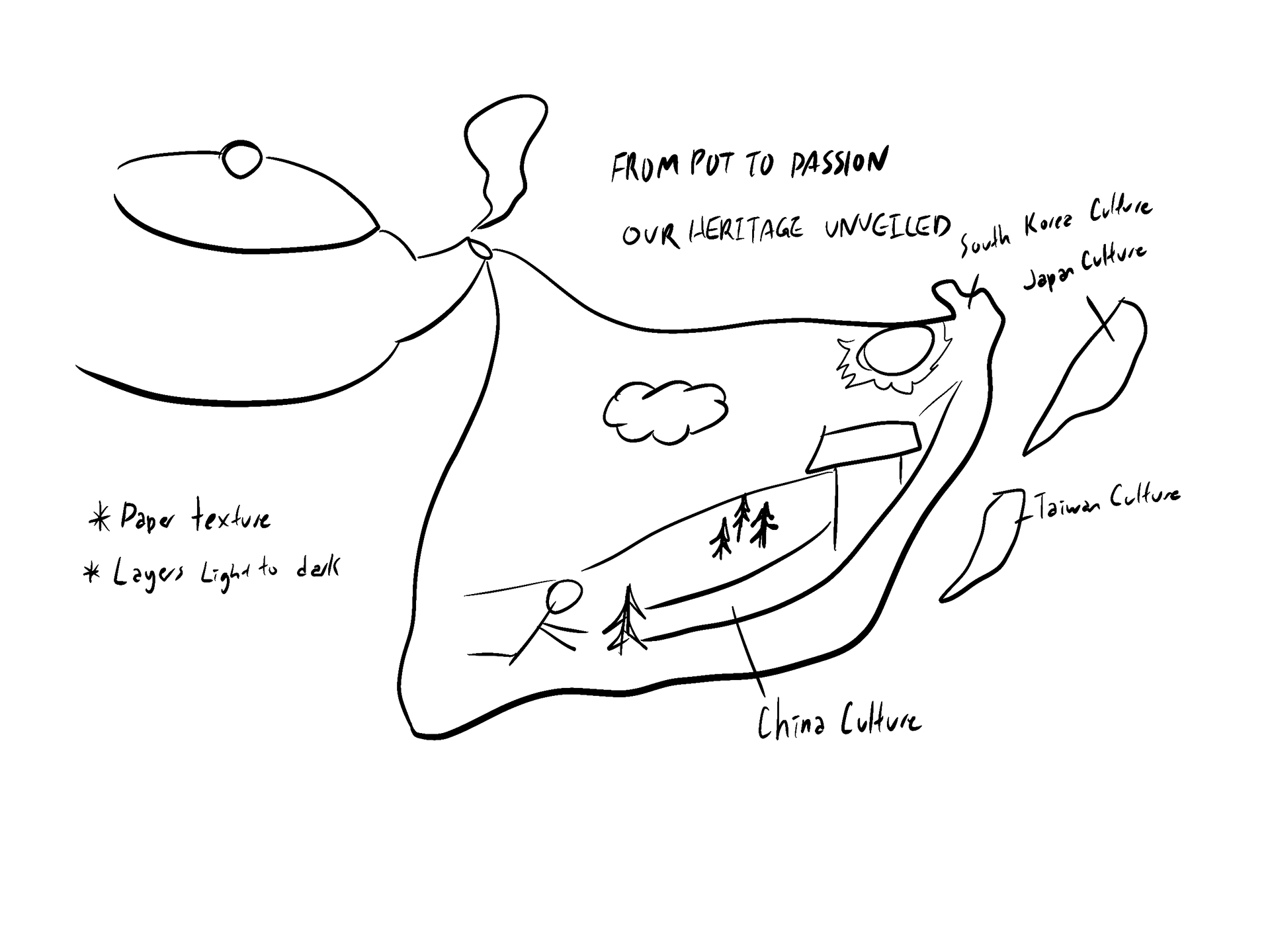
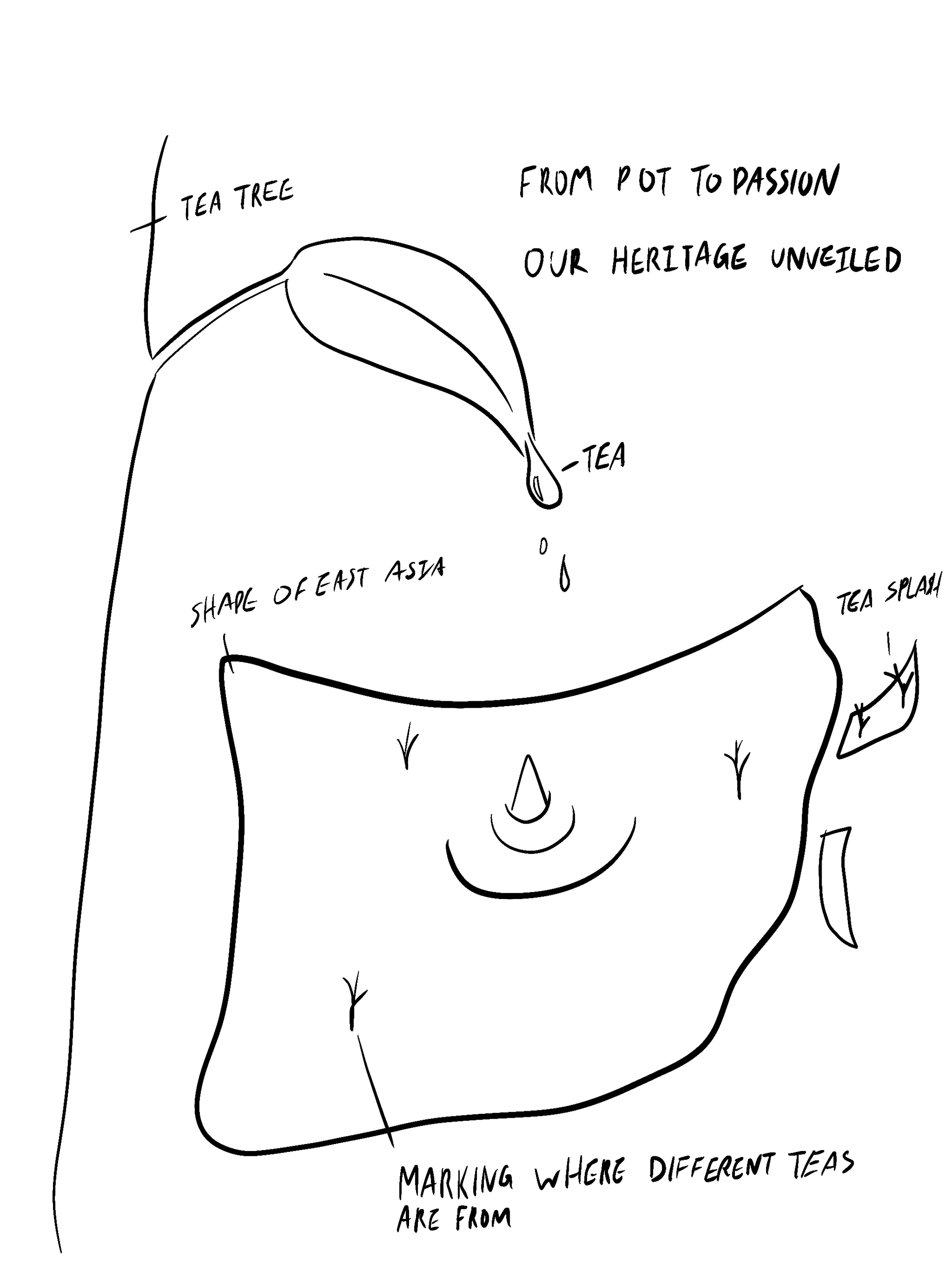
Here are the sketches I first did to see which format I wanted to go for. However, after some consideration, I decided not to put the content in the different tea leaf shapes since it limits how much I can add.
What I did
I really focused on the drop shadows because they were the key to creating a design that had a cool 3D effect, which made the important elements pop off the page. I made sure all the cultural symbols were accurate and really represented their specific cultures. I didn’t want to get anything wrong, so I paid close attention to every detail. A lot of thought went into choosing the right colour scheme too. I wanted to make sure everything looked balanced and visually cohesive so it didn’t feel too overwhelming. Typography was another big part of the design; I even edited the title font to include a subtle tea leaf element, tying everything back to the theme.
Overall, it turned out pretty good with a good balance of the different greens and warm tones, creating a nice contrast that grabs attention without feeling too busy. The design feels clean, yet still full of life, and I’m happy with how everything came together. The paper-cut style, shadows, and cultural elements all work together to give it a unique look that’s both modern and respectful of the traditions.
Size: 18'' x 24''