Introduce the Client/Project
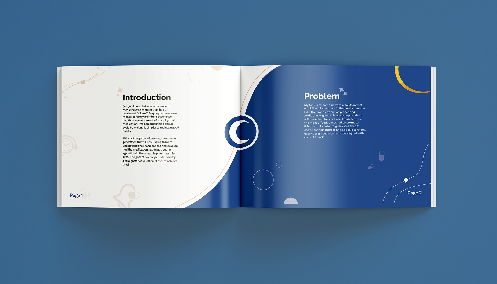
Did you know that over half of treatment failures happen because people don’t stick to their medication? Maybe you’ve seen friends or family struggle with their health because they stopped taking their meds. It’s a tough cycle, but we can change that by making healthy habits easier to stick to.
And why not start with the younger generation? Helping them build good medication habits early on and understand what they’re taking can set them up for healthier, happier lives. My project is all about creating a simple, effective tool to make that happen!
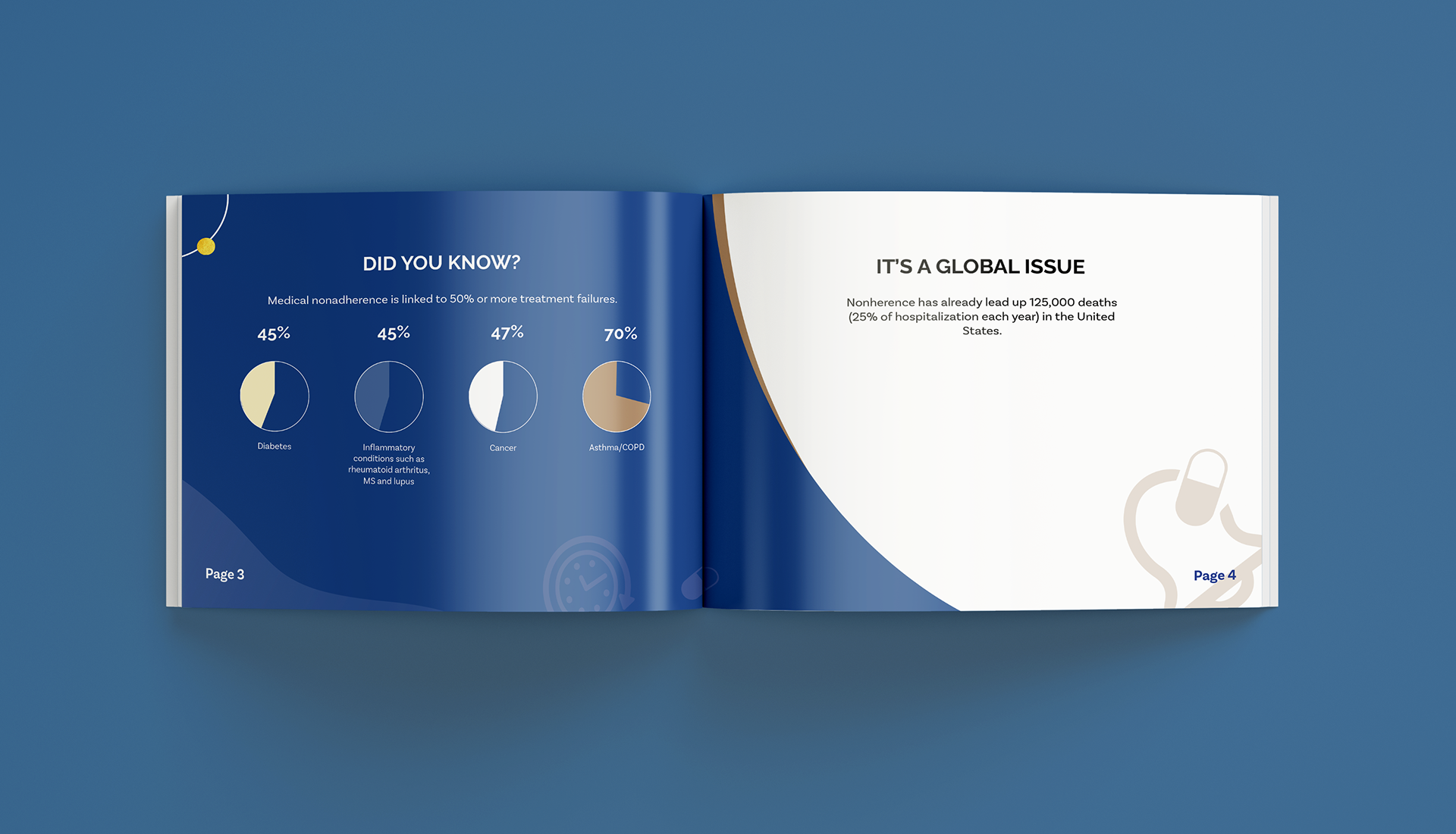
Statistics for medical nonadherence.
Present the design problem
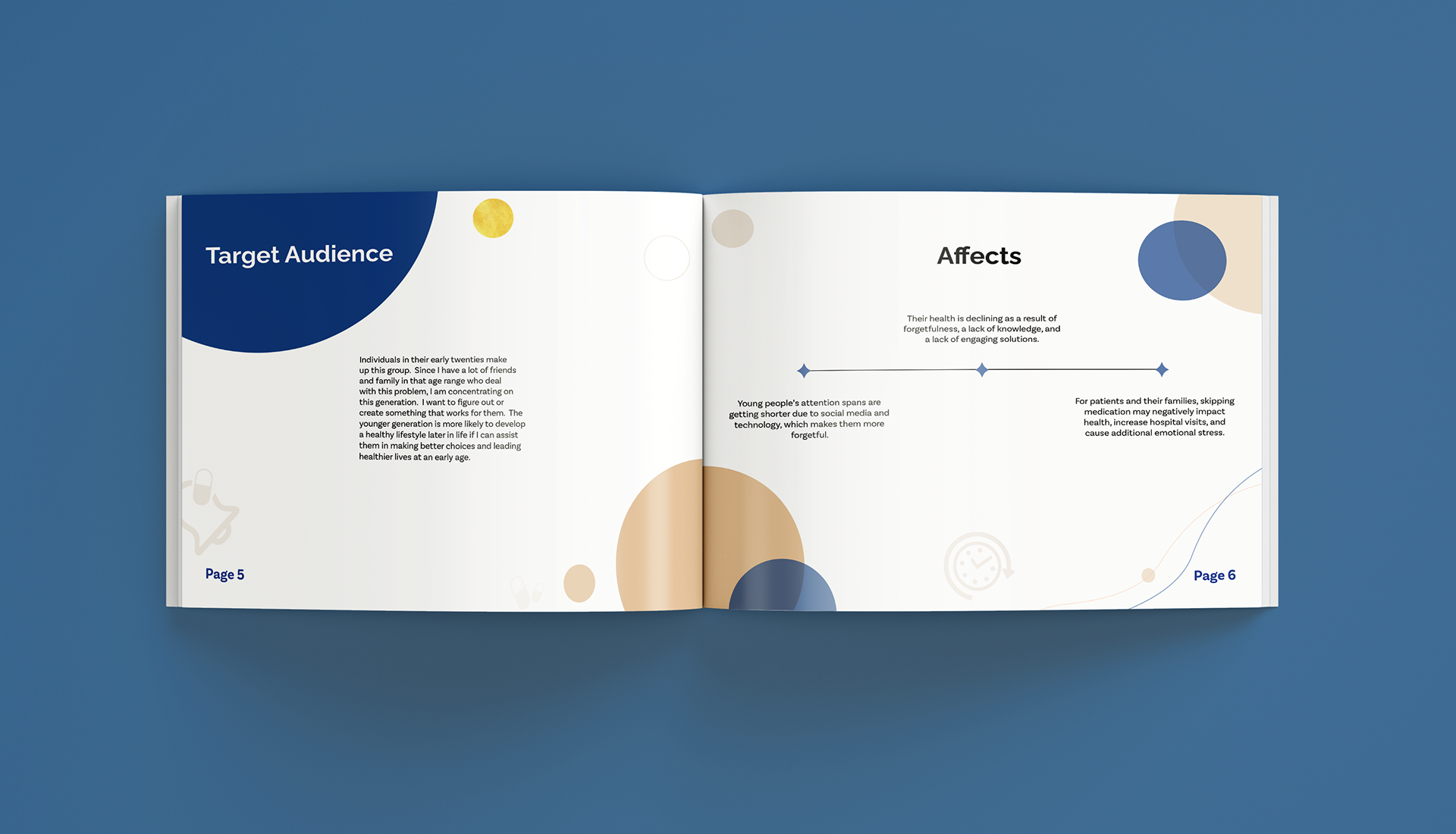
My challenge is to design a solution that helps improve medication adherence among people in their early twenties. On top of that, I need to figure out the best way to market it to this age group, since they tend to follow specific trends. To make this work, every design choice needs to align with what’s currently popular, ensuring it grabs their attention and resonates with them.
My user persona for this project. Delilah is 23 years old and is working 2 jobs. She struggles with taking her medication while juggling with a busy life. Her goal is to find something that will help her keep on track with her medication and improve her health overall.
Recap your role
I'm not just the designer for this project, I also need to understand and relate to people struggling with medication adherence. By seeing things from their perspective, I can create something that actually helps people in their early twenties stay on top of their meds.
Share the solution your design
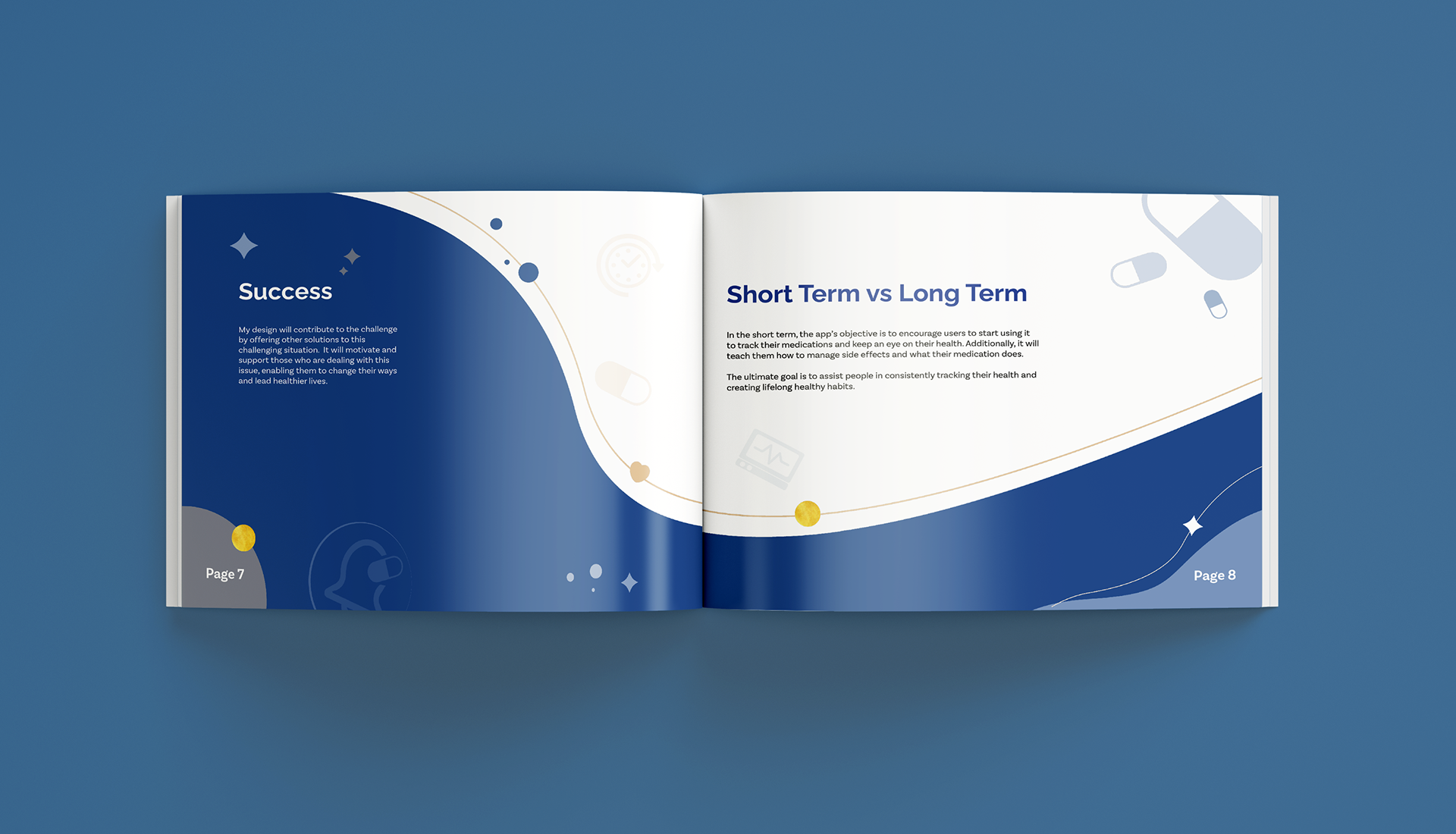
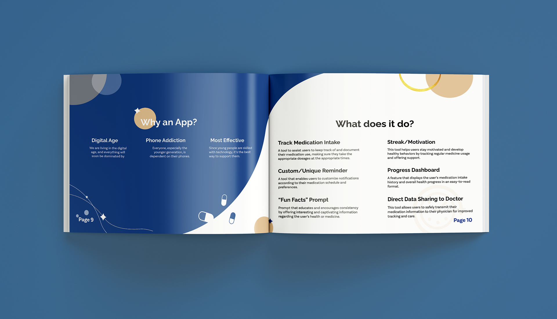
These days, most young people are glued to their phones, so why not use that to help with their medication adherence? My solution is a smartphone app designed to make it easier to track medication, set personalized reminders, and learn interesting facts about the meds they’re taking in a fun way. It also includes a streak or motivation feature to keep users on track, a progress dashboard to see how they’re doing, and a way to share health data directly with doctors to avoid communication errors.
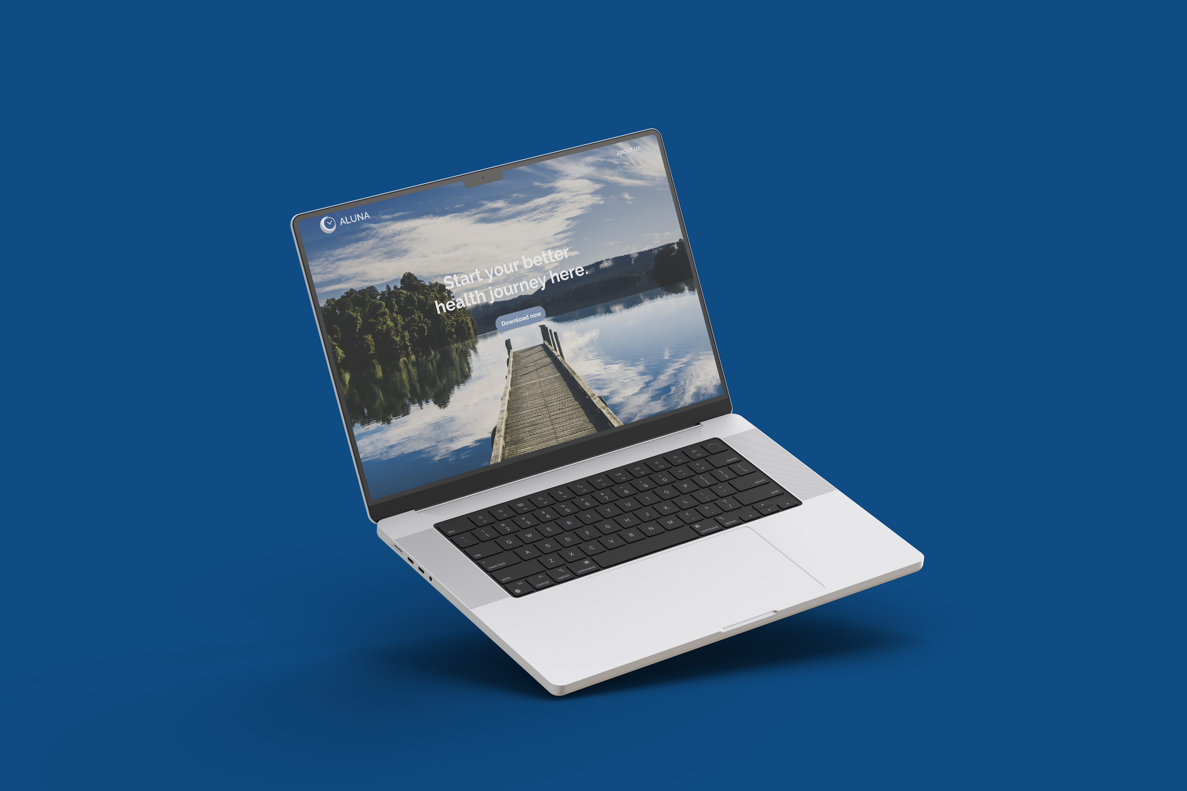
For marketing, I plan to run ads on social media, design and distribute flyers, create targeted ads and leaflets for younger audiences, and even feature the app in magazines. I’ll also provide step-by-step guides to help users navigate the app and build a website to offer extra support and information.
Here is the mood board that I am using for this project. I wanted to go for more of a minimalistic/modern feel to match my target audience. I defaulted to Raleway since it's usually used for a minimal style. For the colours, I wanted to use something that reflects a sense of calm and tranquility; so I picked some shades of blue with the secondary colour of brown to highlight certain designs.
Walk through the steps of your design process
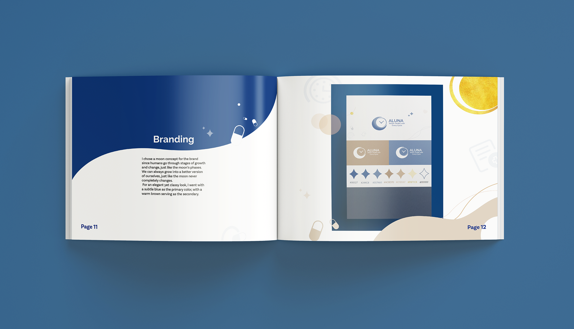
I started by developing the app’s branding with a moon-themed design. The moon symbolizes cycles, phases, and renewal, which ties into the idea that while we can’t completely change who we are, we can go through different stages and work toward healthier habits. This reflects the app’s goal, helping users take steps toward better health without feeling like they have to completely change themselves. I also included a clock in the logo to emphasize the app’s role as a reminder system.
This is the logo suite I made for this project. Like the moon’s phases, we experience periods of growth and transformation. Just like the moon never fully changes, we can always evolve into a better version of ourselves.
For the colours, I chose a muted blue for a peaceful yet elegant feel, complemented by a warm brown as the secondary colour.
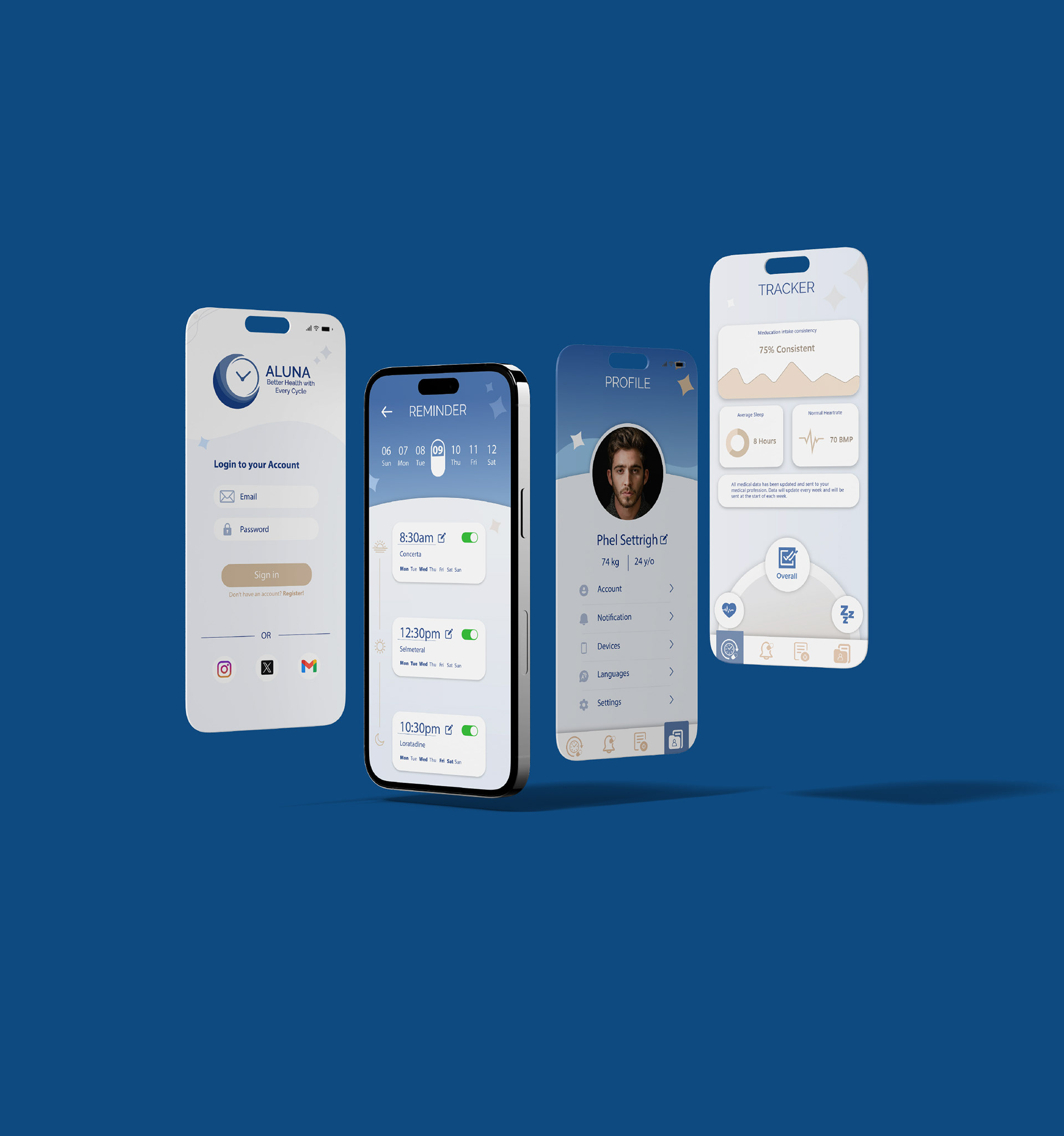
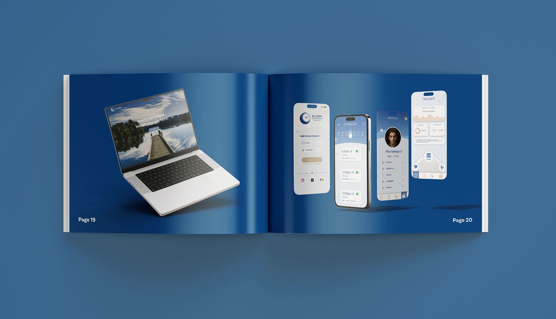
Once the branding was set, I looked into current app design trends and found that younger users prefer clean, simple layouts. So, I took a minimalist approach, keeping each screen uncluttered while adding subtle details like stars and medical icons to stay true to the brand. I chose blue as the main colour, with brown as an accent, to keep things visually interesting without losing the minimalist feel. The result is a phone app design that’s both sleek and elegant.
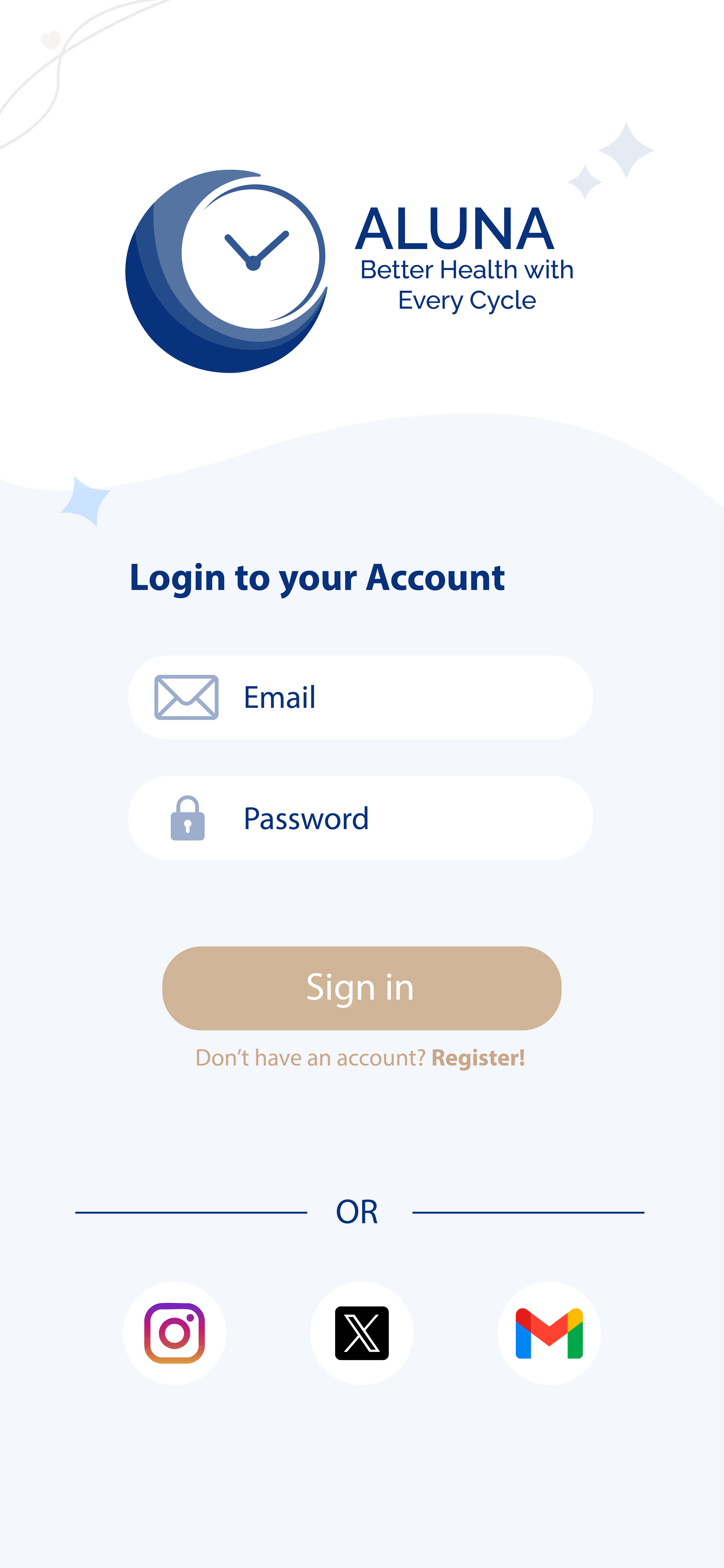
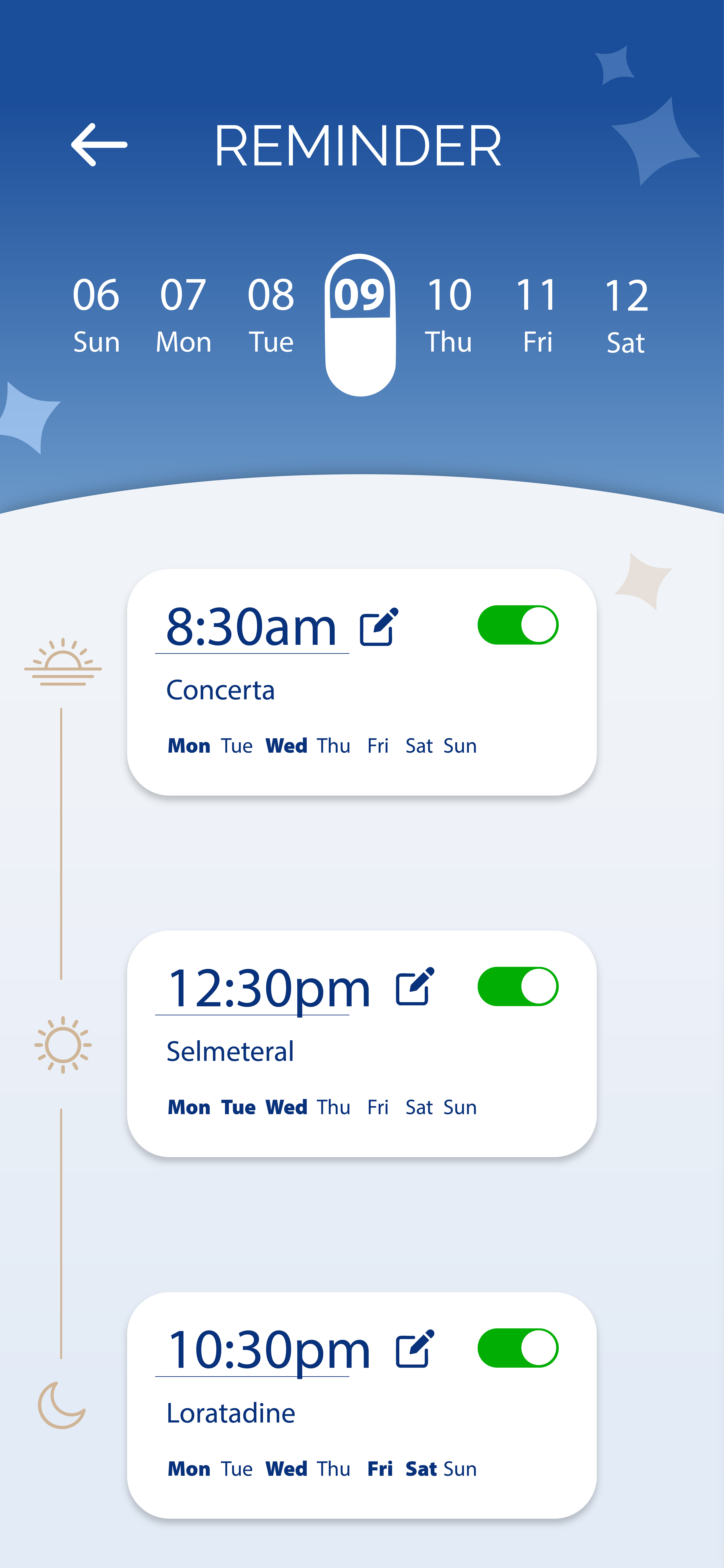

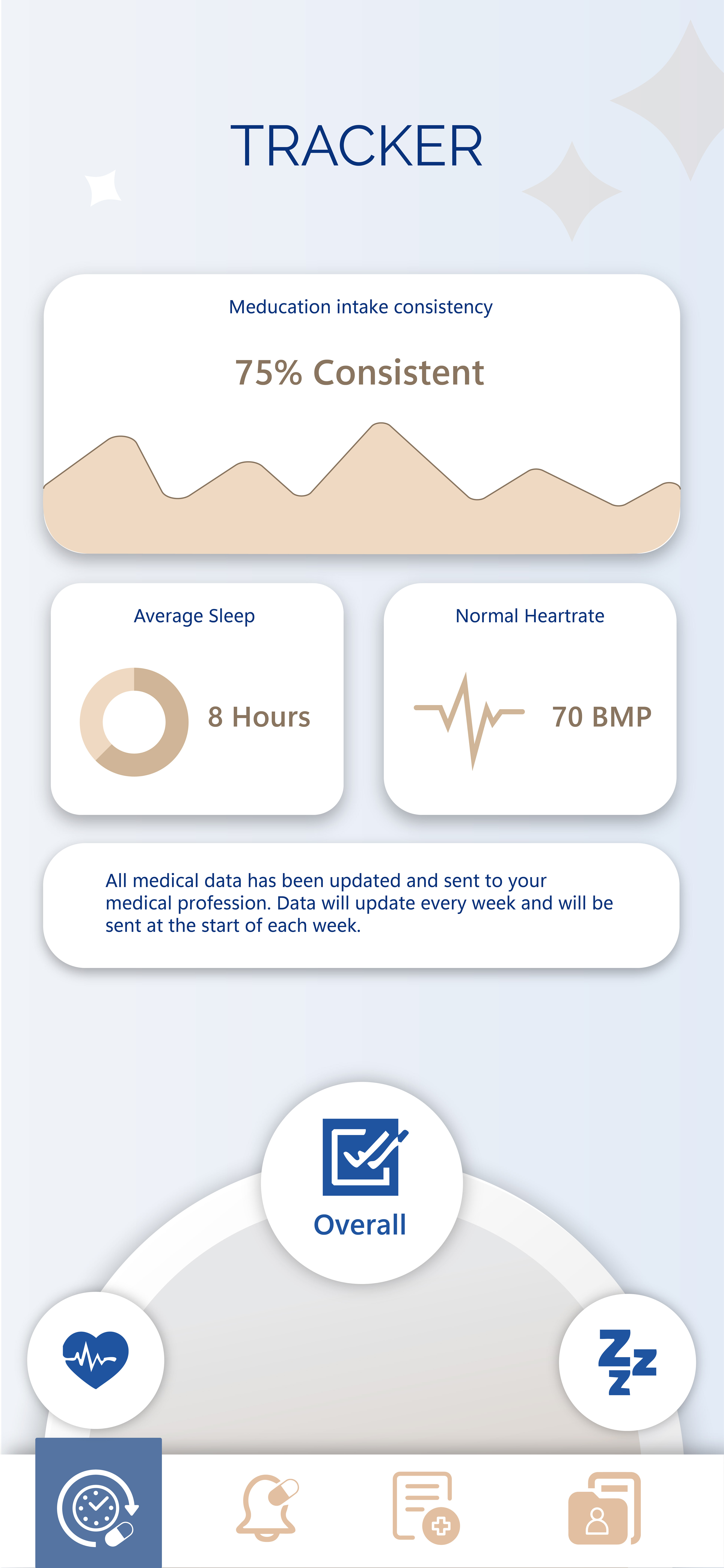
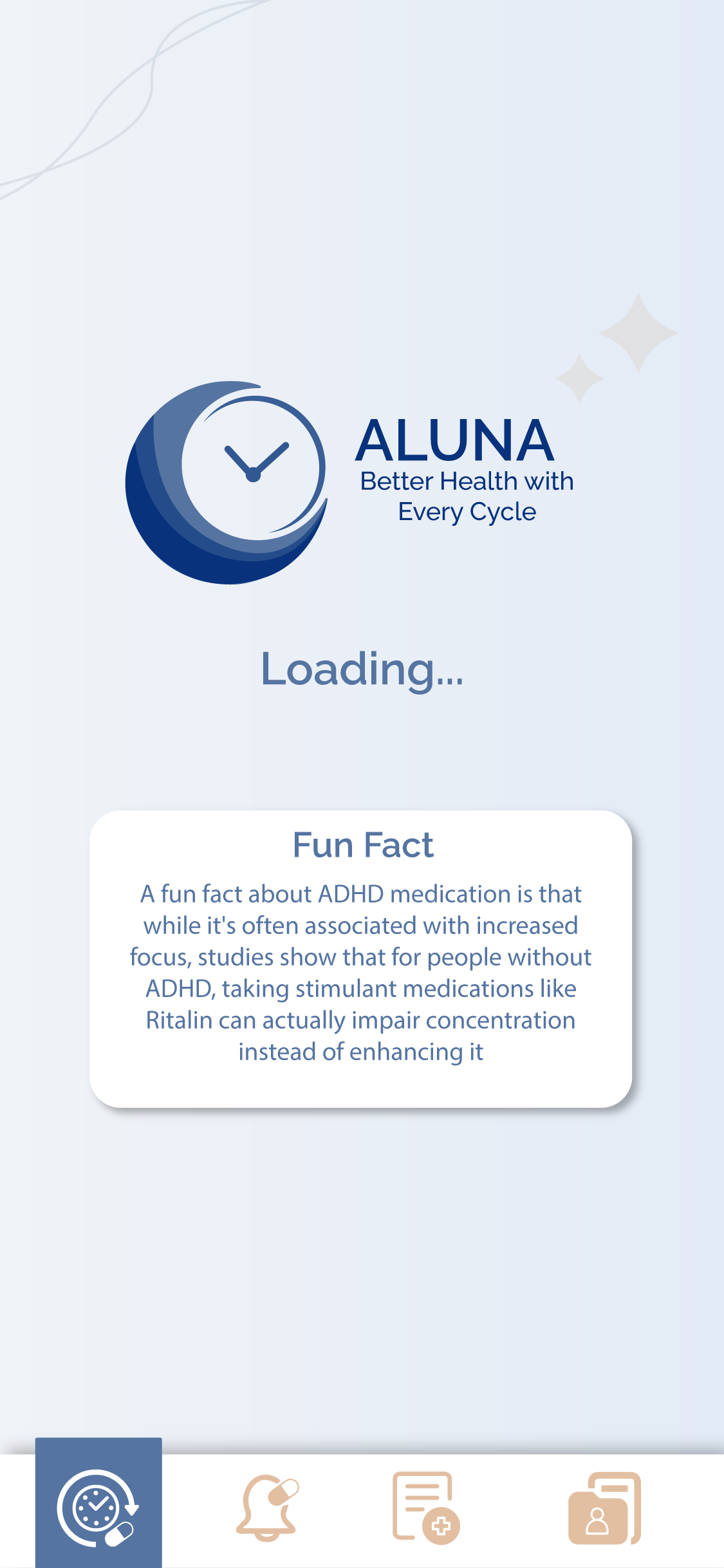
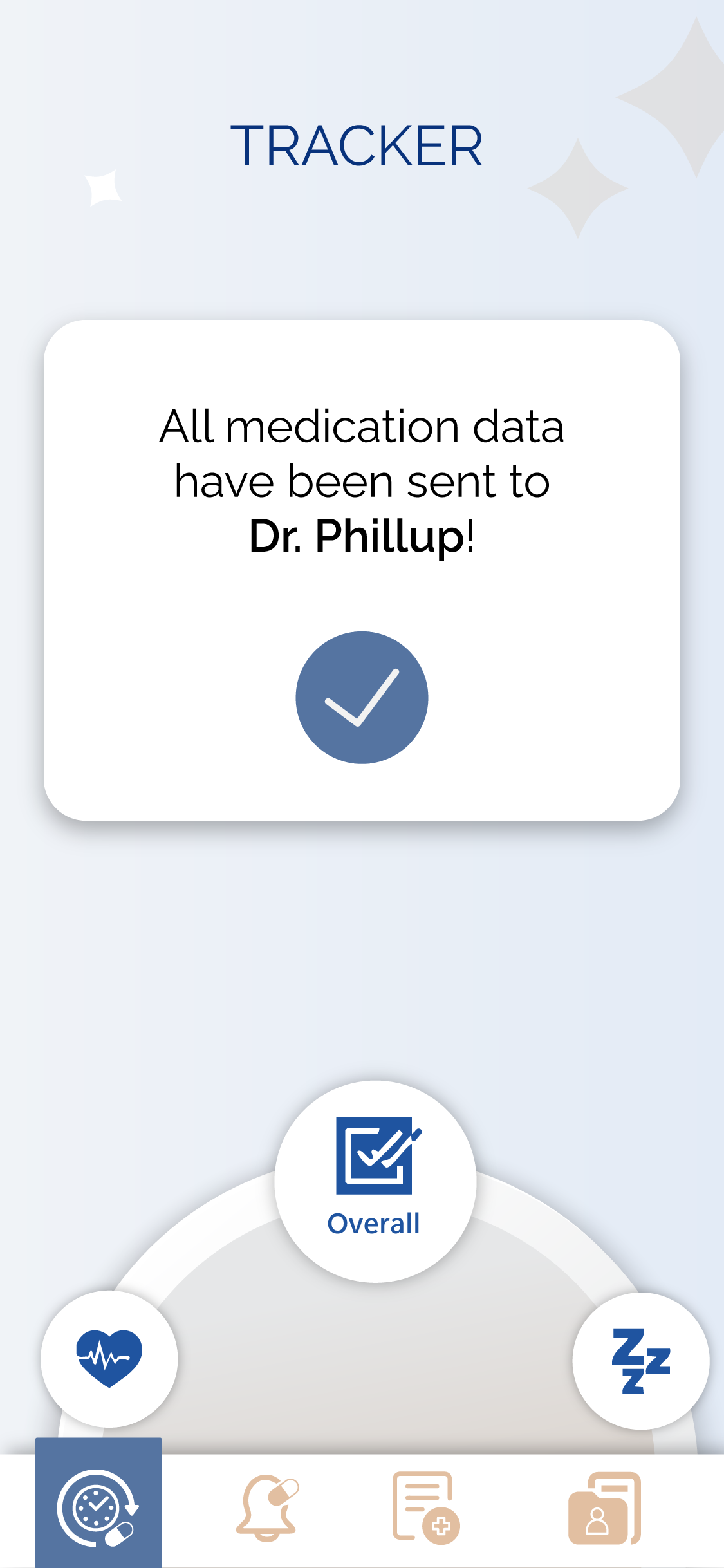
These are the phone screens that I have made. They are a blend of minimalistic and modern. I added some simple icon elements like the stars and abstract lines to add on to the design to make it more unique.
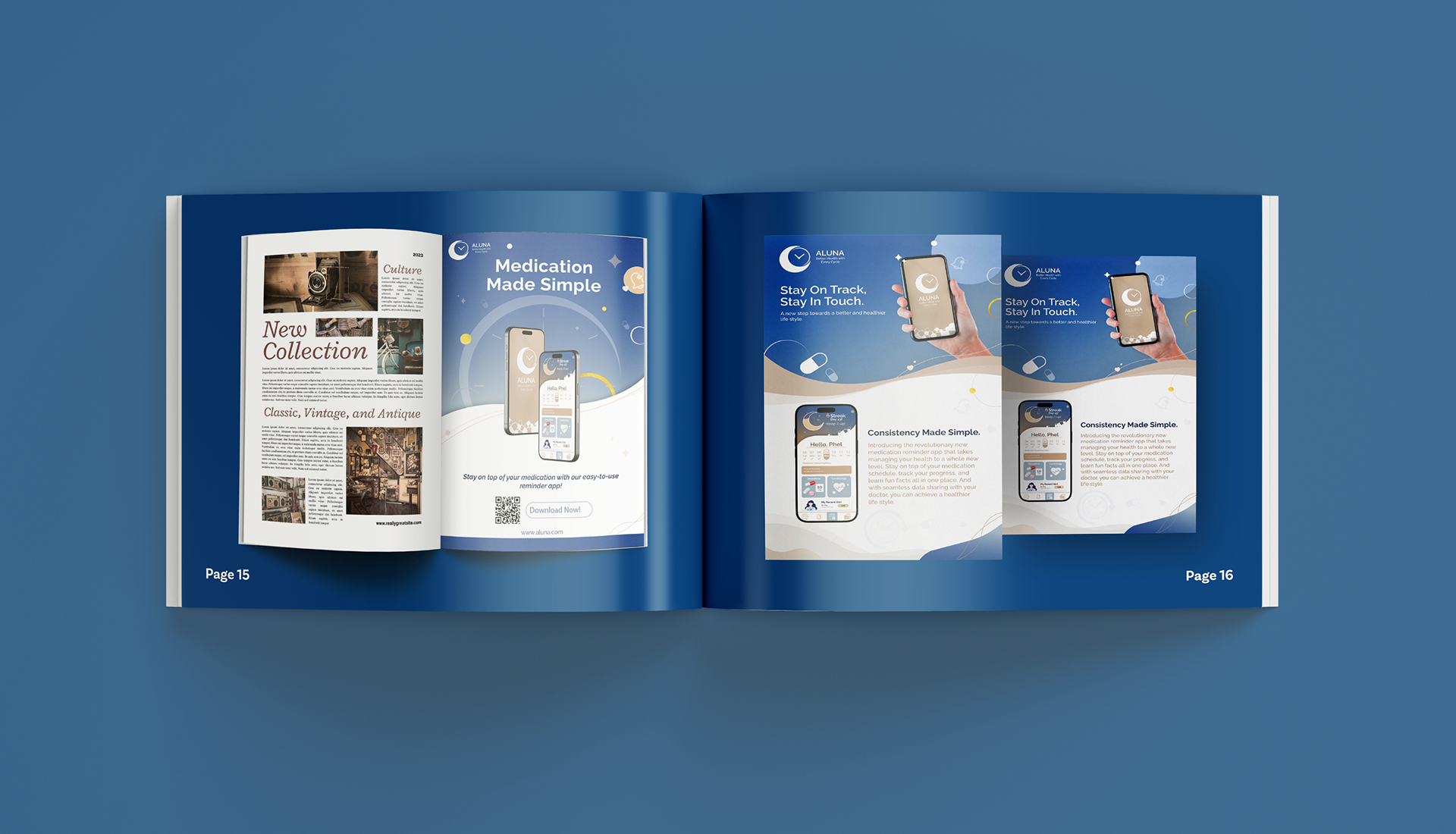
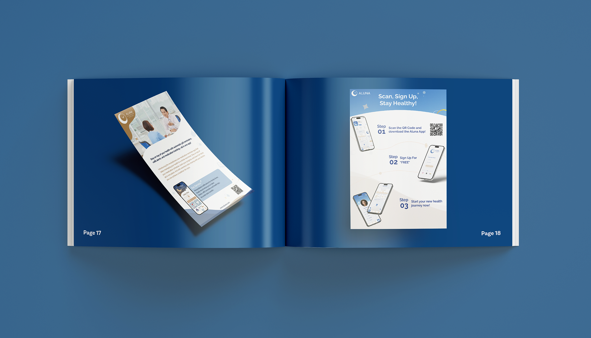
For the ads, I wanted a design that matched the branding while still feeling fresh and unique. I used small icons and abstract line elements in the background, with phone mockups as the main focus. Each ad includes key info about the app, along with a QR code for easy access. My goal was to keep things simple yet distinctive, and I’m confident that the final designs strike that balance perfectly.
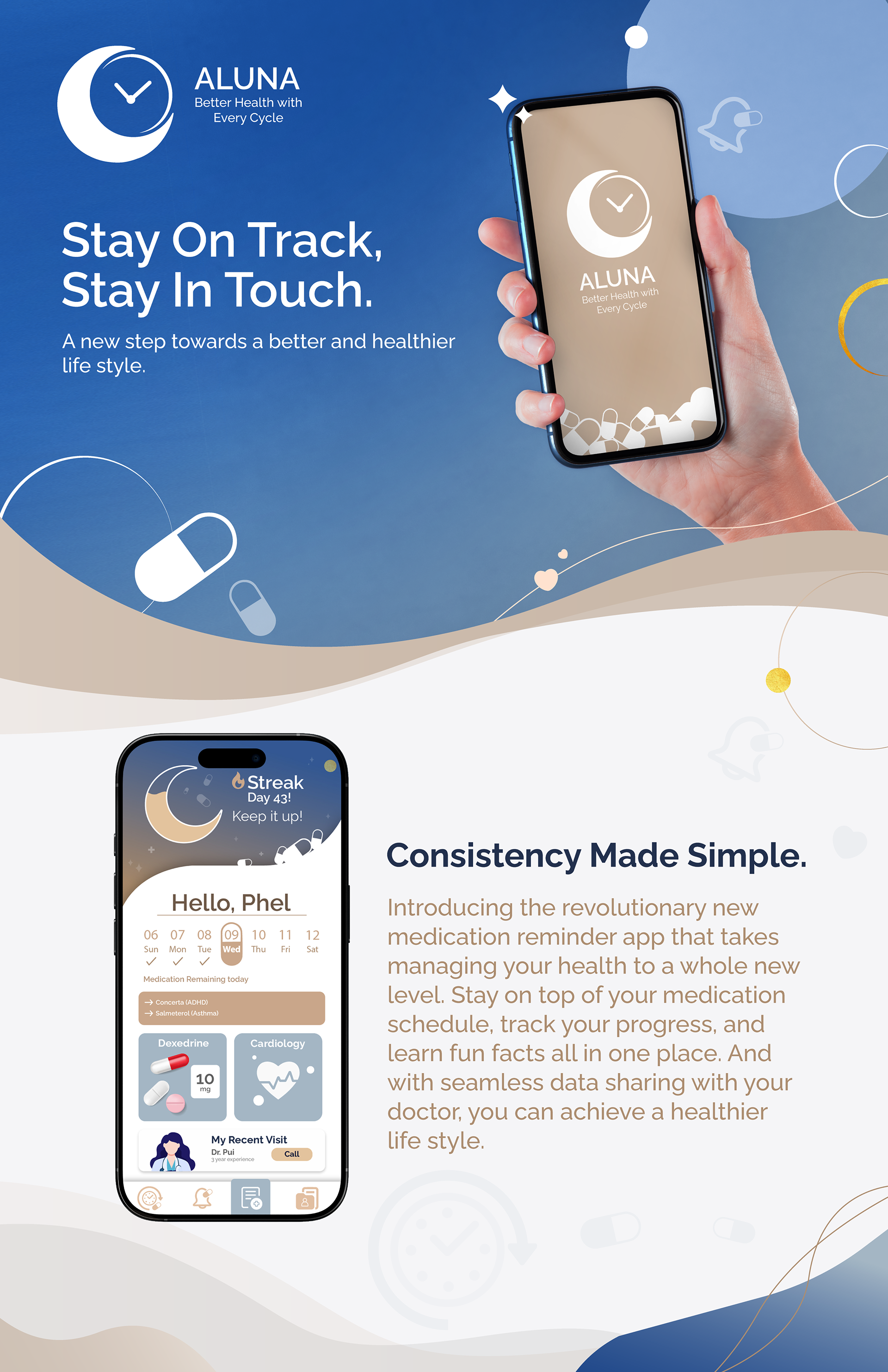
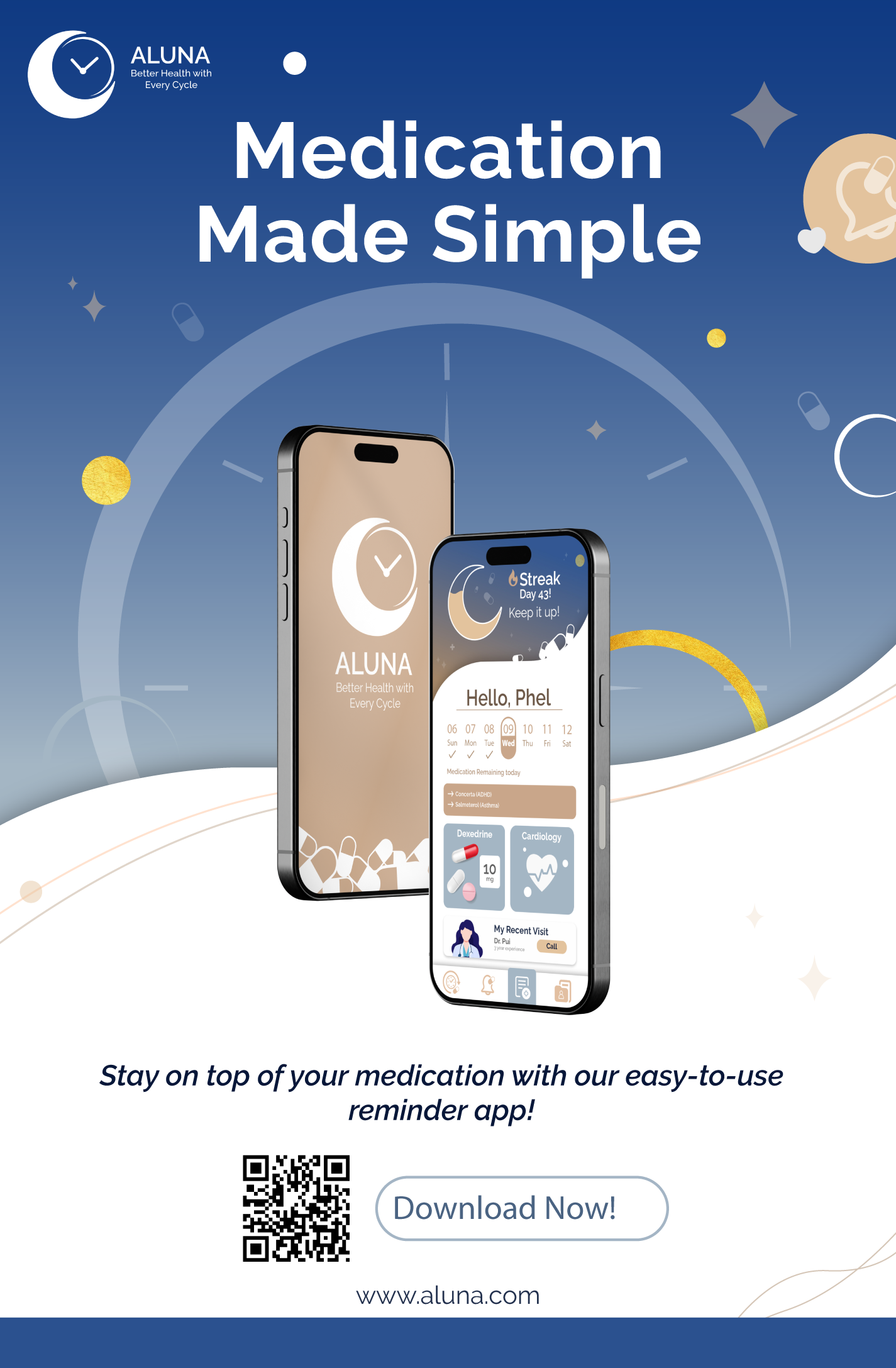
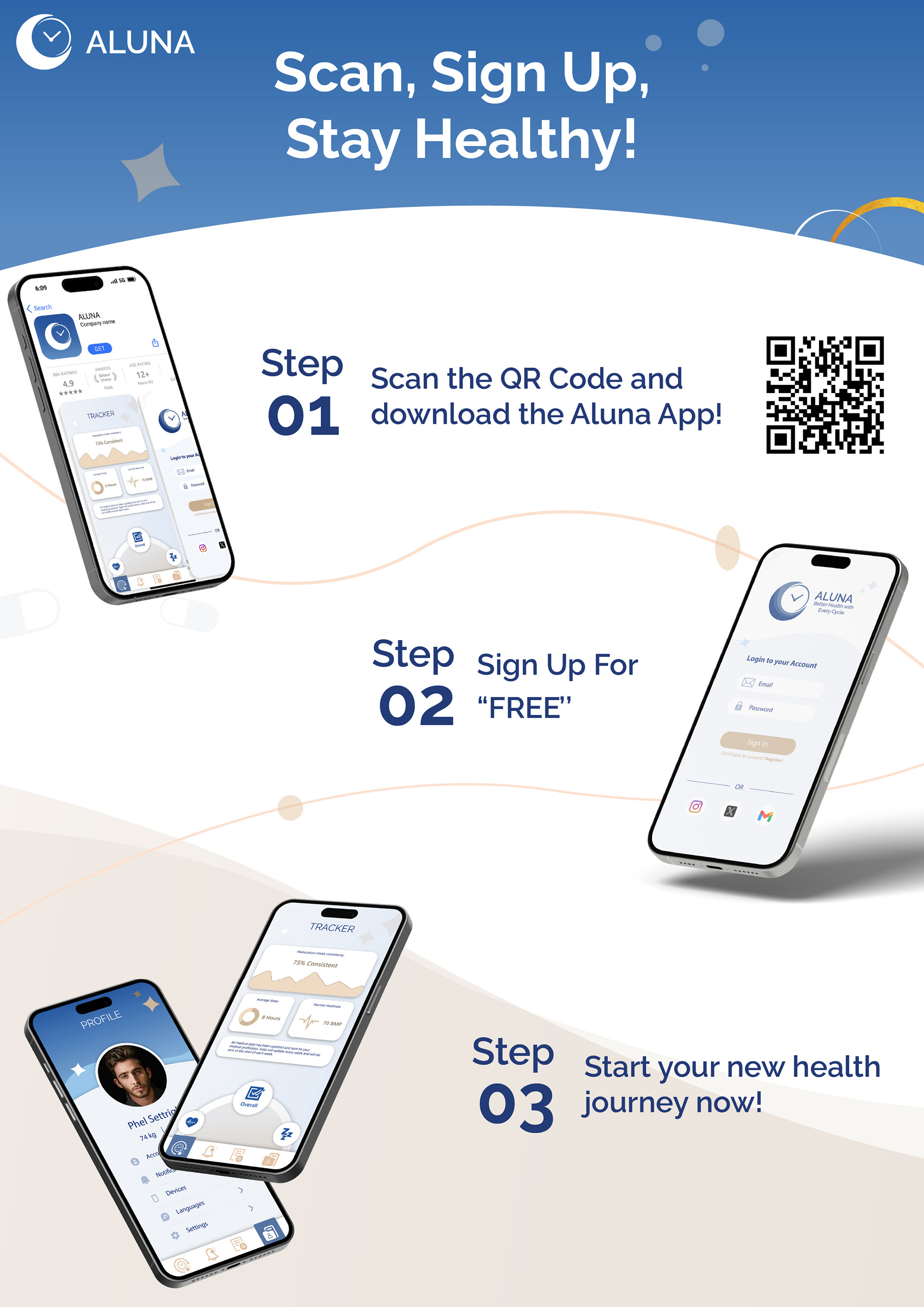
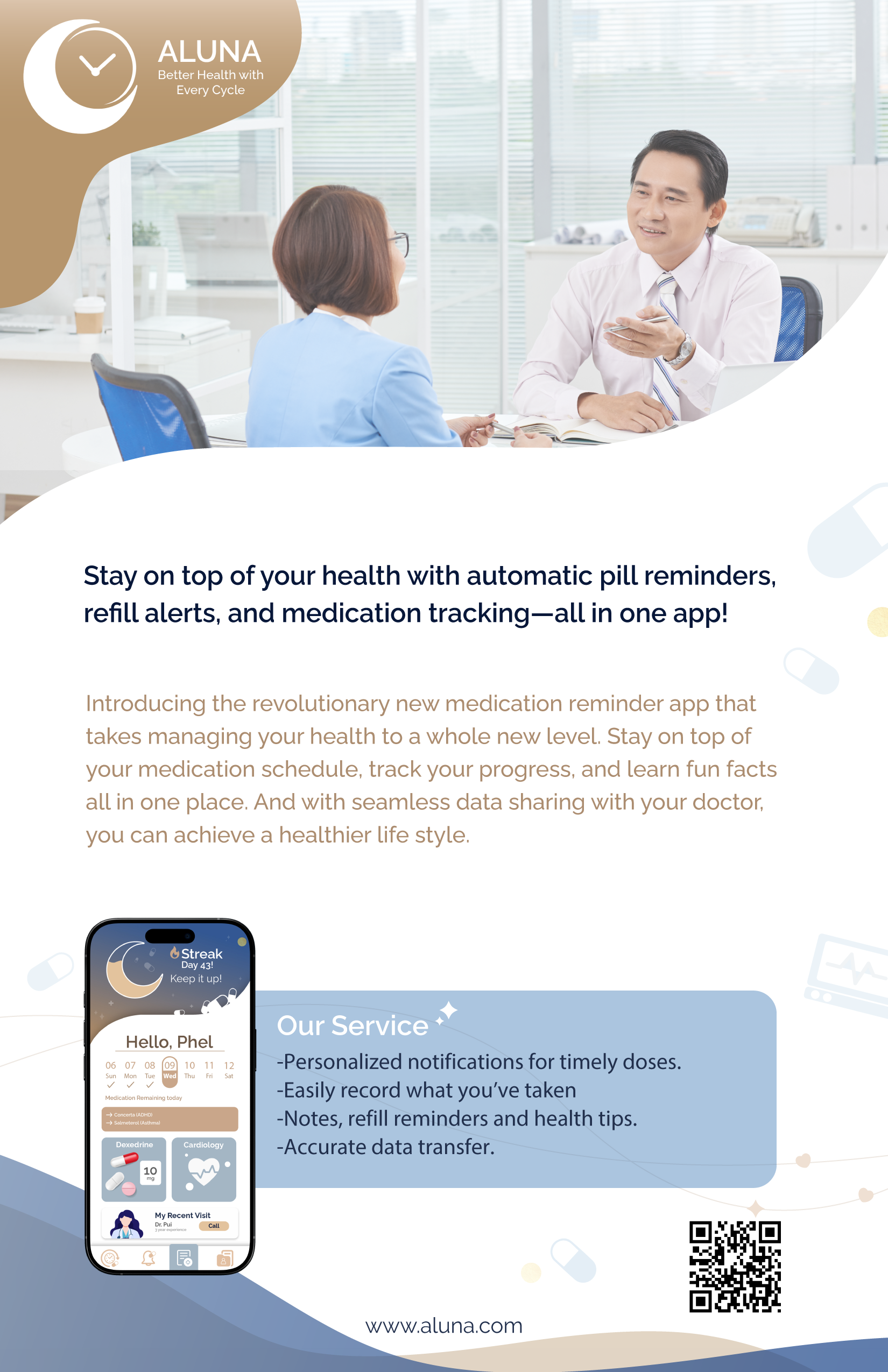
These are the ads I made for the phone app, they are all from the same series but for different media. The one on the left is for a step-by-step tutorial on how to download the app; it will usually be found in a doctor's office. The second one would be a pamphlet that a doctor would give out. The third one is a full-page magazine ad. The fourth is a poster. Finally, the last one is a social media post.
Describe the result
I'm really happy with how both the app and the ads turned out. They feel like they belong together as part of the same brand, which was super important to me. The colour contrast helps highlight key info, and the overall design feels clean and puts together. Overall, I’m proud of the work I’ve done and confident that it’ll connect well with the target audience.

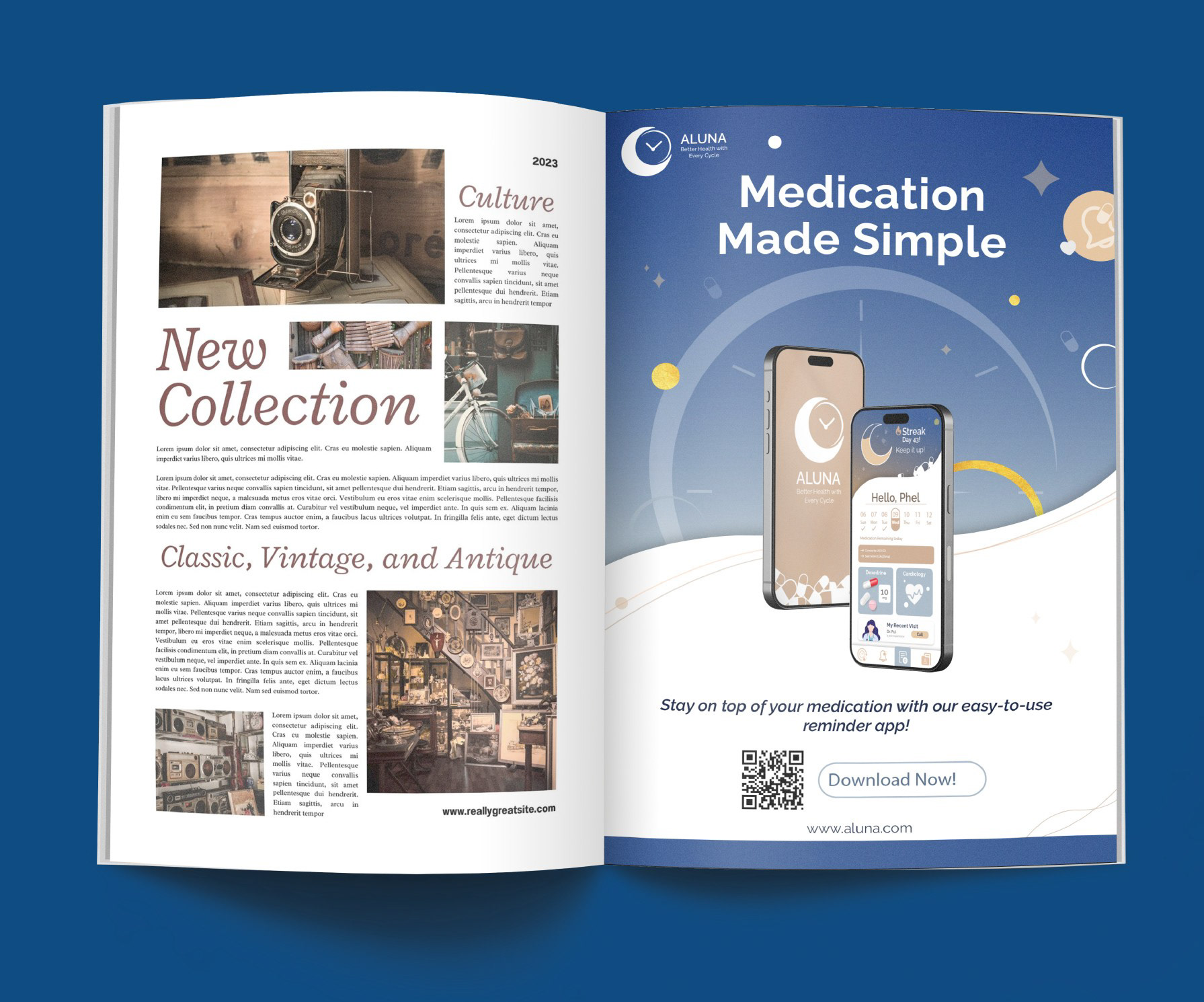


Leaflet size: 8.5'' x 5.5'' Magazine size: 4.75'' x 7.25'' Phone screen size: 2.4'' x 5.1'' Poster size: 11'' x 17''
Step-by-step size: 8.2'' x 12'' Social media size: 8.8'' x 6.2'' Website size: 1440px x 7944px
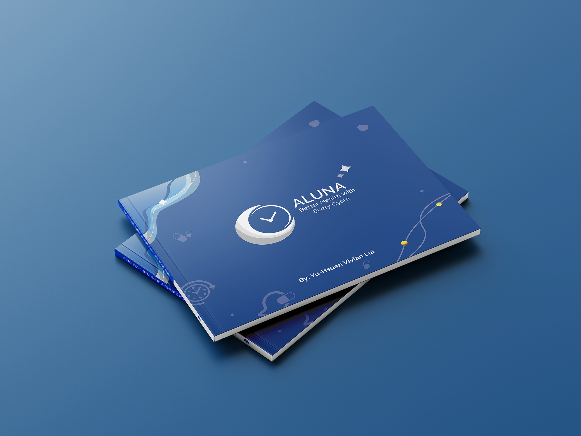
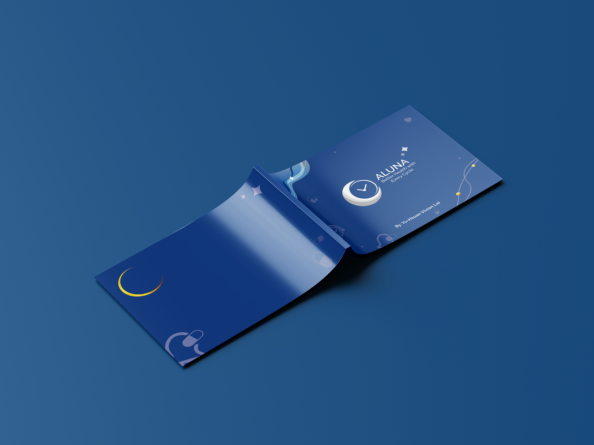
Aluna Booklet


Note any key learning
I learned a lot from this project. I’ve realized just how ineffective current methods are at addressing medical non-adherence, and how challenging it can be to create products that really fit a brand. I also got a better understanding of trends and how they constantly evolve. But honestly, designing apps and ads for the same brand is no easy task, you really have to get the brand, use the right elements, and make sure everything has a consistent feel.
Wrap it up with a short conclusion
Overall, I really enjoyed the process of designing different ads and creating the app. It was a cool experience getting to work on all the different aspects of a brand. In the future, I’d love to design more brand elements and maybe even create one from scratch. I’m excited to dive into this creative journey again and make it even better next time.